Halloween Costume ideas 2015
Articles by "Photoshop tips"
@dorothiar #arttips #interview 101 2 Column Template 2012 mentee 2013 2013 mentee 2014 2014 mentee 2014 Portfolio Winner 2014 SCBWI Portfolio Mentorship Winner 2015 mentee 3 Column Template 360 3d 3d print 3d printing 3delight 8bit Abbey McCulloch abstract acryla gouache acrylic action addon adobe Adobe Flash CS3 Adobe Illustrator Advanced Tutorials advection Advertising advice Agata Wierzbicka agents airplane Al Wiseman ALA Alan E. Cober Alan Lee Alex Ross Alexandra Compain-Tissier Alexandra Lekias Alexandra Levasseur Alexandre Korobov Alexis Winter algorithm alien ALT Amelie Hegardt Amit Shimoni amusement an Ana Aranda analog Andrea Hrjnak Andrea Hrnjak andrea offermann andreaoffermann andreazuill Andy Musser Angela DiTerlizzi Angelika Peißker animal logic animals animation animation nodes anime anisculpt Anja Kroencke Anna Higgie Anna Jensen Anna McKay Annabel Briens AnneBerry Anneke Krull Annu Kilpeläinen anstudy anthology António Soares ar arduino area armature arrange array array modifier arrow art art director art directors Art is fun! art reps art tools Artaksiniya arthictecture arthur rackham artists artwork ase Ashlyn Anstee Asian aspiring asset atom attribute attribute transfer audio Audrey Kawasaki augmented reality aurasma Aurelius Battaglia author illustrator automatic automation Autumn Whitehurst avatar Avrom Yanovsky AW14/15 award awards Babeth Lafon Babies baboon Baby Love Background background color bacteria bake baking ball Bamboo banner Banner images banner making Barbara Dziadosz barcode basic bbox beads beats Bec Winnel beginner Bel Johnstone Ben Denison Bernie Fuchs Berto Martinez Beth Krush better photos bge Bijou Karman Bike biscuit bishop black and white black and white art Blair Breitenstein blam blender blender game engine blender3d blending Blinkie Blinky blob blocks Blog Tips blogger Blogging Friends blogs Blonde blur effect in pixlr and photoshop blur images and pictures bmesh bmesh viewer bolognaragazziaward bombing bone bone modeling bones book book launch books boomerang bottle bounding box bowl bpy brian eno brian ormiston Brian Sanders brian won brick bridge Bridget Davies bright Brooke Boynton Hughes build modifier building burns business Buttons bvh cage Caitlin Shearer caldecott calibration camera camera settings camera tips Candle capcom card career Carole Wilmet cartoony Cassandra Rhodin cast Catherine Campbell Cecilia Carlstedt cell center pivot centipede cg cg photography chair challenge Chanel changin color in pixlr changing color chaos character Character Bible character development charcoal charles Charlie Dot Charlie Hebdo Children children's book illustration chocolate Christina Drejenstam christina forshay Christina K christinaforshay Christmas Cindy Derby circle circle dance city cityengine clock clones cloning cloth Cloud based clover CMYK Coco Chanel Cody and the Fountain of Happiness coffee collect collection Collections collision color color balance color cast color correction color mode color study colorful Commercial Use complexity component compositing composition computational thinking computer concept art Condensed Posts conference connect connect the dot connection Connie Lim Conrad Roset constrain constrast contagion content Contest contracts control converter copy copyright Corinna Luyken count Courtney Brims crack Craft craftsmanship Craig & Karl creative creativity creature cricket Cristina Garcia Martin critic criticism critique Crop Crop Tool cross section crowd csv cubism curve curve modifier custom Custom Blog Design Custom Blog Design Tutorial Custom Blog Designers Custom Illustration custom properties Custom Signature custom xml cut cutting plane cycle cycles dae Damien Florébert Cuypers Dan Hillier dance Daniel Egnéus Daniel Segrove Danny Roberts Daren Newman Dasha Tolstikova data data path David Blossom david diaz David Shrigley David Stone Martin Dean Hardscrabble Debbie debbie ohi debbieohi deform deformer degrees deleting background in pixler demo demoscene desaturation of images design design by numbers design process Design Tips dictionaries dictionary Different Text Writing in Pixlr digital digital paint Digital Scrapbook Freebies Digital Scrapbooking disk distance distractions distribute diversion DIY DIY Contest Dolf Veenvliet Doll Doll Bones dolls domino domino effect doodle Doodles door doraemon Doris Jackson Dorothia Rohner dots dpi draw drawing drill driven driver drivers dual versions dummy duplicate duplicates duplication dupliframe dvd dynamic dynamic paint dynamic text E Simms Campbell Easy easy pixlr Easy Tutorials Ed Graham Ed Vebell editing editing photos editors education effect effects ego Eleanor Dalton electric Elia Fernández eliza wheeler Elizabeth Mayville elizawheeler Emily Forgot Emma Zanelli emoticon happy-face Emotional storytelling empathetic characters empty entoforms envy epicycloid EPS Illustration Epson scanner erasers Erin Armstrong Erin Petson erinoshea ernest shepard Esra Roise euler evaluate line Eveline Tarunadjaja evenly spacing vertex event everywhere door exhibition Expandable Posts experiments explode exploded view export expression extrude eye eye color in pixlr eye trick eyeball face rig facial expressions facial setup factory Faiyaz Jafri Families fashion illustration fashion week fcurve feature Featured Fee Harding Feedback fence Fernanda Guedes fibonacci Fifi Lapin file File Types Finalists Finding Nemo fire fix photos Flash Tutorials flicker flip flip flop floor flop flow flower Flowers fnmatch focal point follow up font Fontaine Anderson Fonts food footage For Sale force form formula fractal fracture frame Frames Francois Berthoud Frank Bellamy Frank Furlong Franklin McMahon freckles Fred Steffen FrederiqueBertrand Free for Commercial Use Free for Personal Use Free Stock Photography Free transform tool Freebies Frenchillustration Fritz Siebel frosted mylar fruit ninja Fumi Mini Nakamura Fun function futurism FW2017 fx Gabriel Moreno Gabriella Ibarra game game animation gameart gamma gangnam style Garance Doré Gary Fernandéz gel medium generate generative generator geometric geometry Gerald Lazare Géraldine Georges GIF Gildo Medina Girl Giuseppe Castellano Giveaway glorar goals golden ratio google google docs Google Tools Grant Young graph graphite graphite transfer grease pencil grid group group node growth Gucci Guest Guil Godier gustave dore hair handbook Harper's Bazaar harpercollins Harvey Schmidt Haute Couture head Headers heat map Helena Hauss hexagon hexagonal grid Hiroshi Mizuno Hiroshi Tanabe Holiday Holly Black homology honeycomb hook horror houdini how to how to blur a face or an object in pixlr How to change eye color how to delete an object how to desaturate an image how to edit a image in pixlr how to erase an object how to fix red eye problem how to fix red eyes in pixlt How to fix the parts in pixlr in photoshop How to make a banner in pixlr How to overlap the nevus how to remove a object How to remove an object in pixlr how to remove red eyes How to Remove the Background of an Image in Pixlr How to remove the parts that you don't want in pixlr and photoshop how to replace color How to write a Patterned Text in Pixlr how-to Hsiao-Ron Cheng hsv hue humor Hyshil I love illustration magazine idea ideas Igor+André illusion illustrating illustration illustration board Illustration Books Illustration Intensive Illustration Now! Fashion illustration process Illustrations Illustrative Berlin illustrator Illustrator Intensive Illustrator Tutorials iloveillustration magazine image ediditing lessons Image Ready image sequences image theft imaginative import import text import vertex color improving photos inbetween index visualizer Info Ingrid Bockting ink inktober input Inspiration inspirational quotes install instance instance switching intensive interaction Intermediate Tutorials internet interoperability interpolation intersect intersect edges intersecting intersection interview introduction invoke subprogram io ipad Irana Doucer Isabella Hemmersbach islam islamic iteration Izzie Klingels Jack Hearne Jack Tremblay James Dignan James Gurney japanese Jason Brooks Jean Kim Jeanne Detallante Jen and Chris Creed Photography jen betton Jen Rofé Jenny Mörtsell Jeremy Combot Jeslyn Kate Jesse Auersalo Jessica Jessica Lanan jessicalanan jewellery jewelry jiggle Jim Schaeffing Joe Bowler Joe Cleary Joe Isom Joe Krush Johanna Goodman john maeda John Vernon Lord joint Jordan Sondler JPEG JPG jpop juana martinez-neal juanamartinezneal Judge Judit Garcia Talavera Judith van den Hoek Judy Byron Schachner Jules Julien Julian Beever Julie Verhoeven Jump Break Tool JW Anderson K-Fai Steele Kaethe Butcher Kareem Iliya karel zeman Kate van Harreveld Kathrin Kuhn Kathryn Ault Noble Kathryn Noble Katie Kath kdtree Kei Meguro Kelly Beeman Kelly Light Kelly Smith kelly sonnack Kelly Thompson keyframe keyframing kidlit kidlitartists kimberlygee Kirkus Review Kisoo Chai Kodak Konstantin Kakanias Korean illustration Kotaro Chiba Kozue Himi Kremos Ksenia Finogeeva KT Smail kuler Kustaa Saksi Lanan Laptop larry gritz lasso tool latte lattice Laura Callaghan Laura Laine Lauren Rille layer layering Layla Holzer layout leaf learning learning blender LED Leendert meets Ingrid lego length Leonard Starr lessons levels LFW A/W 14 liangzhu liero lightbox lighting lightning Lina Bodén Lina Ekstrand Linda Dorn line line connect line drawing lines Links Linky Love Linn Olofsdotter Lionel Gilbert Lisa Anchin Lisa Billvik Lisa Krannichfeld lisaanchin lisbeth zwerger Liselotte Watkins list list comprehension List First Last listing locator lofting logo Logo Design Lola Dupré London Fashion Week loop looping loops looptools Lorraine Fox lossless lossy lost weekend lostweekend lotte reininger Louis Glanzman louis vuitton Luciana Rondolini luciograph LULU* lv Lynnie Zulu Mac macgyver macouno maeda Magda Antoniuk magic Magnus Voll Mathiassen mailing mailings maker Makiko Sugawa making banners Malika Favre MAMP mandala manga map map range maplelam mapping Marcel George Maren Esdar Margot Macé Margot van Huijkelom Maribeth Olson Marie El-Ahmar Marilyn Conover Marina Esmeraldo Marine Marbleindex mario Marlies Niemeijer Marsha Riti Martha Rago Martin Krusche Martine Johanna mask masking material materials math matrix matrix apply matryoshka Matt Baker matte medium Matthew Woodson maya maze mdd Meagan Morrison measure megaman Megan Hess Meizhen Xu Mel Crawford memory mentee mentees mentors mentorship program Mercer Mayer Meridth McKean Gimbel mesh mesh cutter meshlab Meta Tags metal gear rising Meyoko Mia Overgaard Micca mice Michael Sanderson Michela Picchi middle grade midi miku Milan milipede minidom Minima Mio Matsumoto mirror cut Misc Miss Blackbirdy miss maple's seeds Miss Take Mitchell Hooks mixamo mixing Mobile Apps mocap mod model modeling modifier modular modulation modulus mold molecule molly idle Molly Ruttan Molly Ruttan Illustration money monitors monkey mono-zero monster monster university morph morpher mosaic mosquito motion motion capture motion capture mouse motion trail moto360 mountain muji Muriel Wood Murray Tinkelman mushroom Music and Podcasts My dead pony Nadia Flower Naiad Einsel Naja Conrad-Hansen Natalie Brockett Natalie Foss nathan vegdahl nautilus Nav Bar navigation needle-felting negotiating Neil Boyle neon nescbwi14 nested New Blogger Questions New Blogger Template Tutorials new user pixlr new year new york New York Fashion week Newbery nicholas nicholas bishop Nicholas Hong Niki Pilkington Niso Ramponi nla No Software node node-based nodebox noise non linear animation Non-Web Font normal Noumeda Carbone npr number NURBS NYFW object object color change object info octopus offset Ola Volo Olaf Hayek old formats opaque projector open movie open shading language open source openshadinglanguage opensoundcontrol optical organization origami original art show Ornaments osc Oscar Schlienger osipa osl outline outliner output Pages paint paint weight painting painting on illustration board painting on wood painting with movie painting with numbers Pair pandas panorama Paper paper lantern parabola parametric parent parenting particle particle info node particles pat david Pat Zietlow Miller pattern Patterned Text Paul Faassen Paul X. Johnson Paula Sanz Caballero PC pdb pebbles pencil Pencil Sketch pencils Penguin perfume perlin Peter Helck Photo CD.8B photo editing software Photo Reference Photobucket photographing art Photographs photography photomerge photoshop Photoshop Brushes Photoshop CS3 Photoshop elements photoshop pixlr desaturaion Photoshop tips Photoshop Tutorials Picture Book Builders picture books Pierre Louis Mascia Piet Paris Pietari Posti pingpong pinnochio pipes pixar pixel pixel art pixel generator pixlr Pixlr advanced Pixlr blog pixlr desaturate keep a colorful part pixlr editting pixlr express Pixlr forum Pixlr free transform Pixlr Lesson Pixlr lessons Pixlr mobile Pixlr resizing images pixlr shortcuts Pixlr tools pixlr tutorial pixlr tutorial with pictures Pixlr Tutorials pixlr white black pixlr.com plant plot plotting ply PNG PNG Illustration podcast point point color pointilism polka dots polyCut polygon Pomme Chan pop-overs portfolio Portfolio award portfolio showcase portfolio-advice portrait position Post Dividers postcard poster Posting pot powdered graphite powerhousemuseum Prada presentation print printmaking Prize procedular procedural process processing programming projection Promotion property prototype PSD psy publishing pulse puppet puppetry pydriver pydrivers pyhandler pyhandlers pyramide python quad quick select set quick tips qumarion Rabbit Moon Rachel Ryle radians radius ramp random random motion randomization randomize range float raspi Ray Houlihan reading reading XML READY-TO-WEAR realflow Rebecca Clarke rebecca dautremer Rebecka Skog rebuild recursive recursivedrawing red eye remove reducing glare reference referencing release remesh modifier remix removal remove remove red eyes remove unwanted objects Removing backgroung render rendering renderman repeat repeater repeating replace replacement replacing color representation rerouter resample resampling research Resizing image resolutions retopology retro review revolve rgb rib Ricardo Fumanal Richard Scarry rig rigging rigify Rikke Jorgensen ring ripple roadkill Robert Heindel Robert J. Lee Robert McCloskey Robert Shore Roberta Zeta Robin Rosenthal robot robotic rocks Rodolfo Montalvo Roller Coaster rotation Rousseau rsl Rubin Pfeffer ruler tool Russ Mills russian rut S/S14 S/S15 S/S16 Sabine Pieper sadako Saftey Pins Sainte Maria Sale Sam Weber Sanda Suy Sandy Kossin santoso Sara Andreasson Sara Singh Sarah Jacoby saturation artist tools scan scanners scanning scatter scbwi SCBWI 2015 mentee SCBWI conference scbwi germany SCBWI mentorship scbwi-la scratch scratchboards screensaver screw screw modifier script scrub sculpting seamless Seamless Patterns Search Engines select by material select by name select by type SEO sequence series set keyframe set keyframes shader shading shadow Shannon Stirnweis shape grammars shape key shapekeys shapes shards shatter Sheilah Beckett shell ship shipping shipwright Shoes SHOWstudio shuffle Sid Barron Sidebar Titles Signature Silja Goetz silkworm Simon and Schuster Simon Varela simple simplicity simulation sine Site Engine Optimization Sjoukje Bierma sketch Sketches sketching skin skin modifier skinning slice slicing slides sloth slow parent smoke smoothstep SN snake Sneek Peek snippet Snow Snow White Snowflakes soccerball social media Social Media Buttons Social Networking society of illustrators Society6 soft body softbody Sonia Menti sound sound wave space spaceship sparta special spider spiderman spiderweb spin spiral Spiros Halaris Spiros Halaris x Urban Decay spline Spot Healing Tool spreadsheet SS16 stack stacking stair stamp Stan Galli star starfish stencyl step Steven G. Dobson still Stina Persson stone stones storytelling strand strand info strands street art string stripes structure studies studio style stylistic summary Summary Posts Summer sun supplies surface Susan Farrington suzanne Suzanne Kaufman sverchok swatch switch sydney system table table of contents take out background Tal Drori tangent tangled Taschen teaching teapot Template Templates tentacle Tess Jacobson Tex Avery text text editor Text Formats Text Styles in Pixlr texture texturing The Cartorialist The Grudge Keeper The Purple Book thinker1 Thomas B. Sawyer thread TIFF tile tilecam tiling time time code Tina Berning Tina Kugler tips tips for artists Toby Neilan Tom Baxter Tom Bjarnason tombow tomie depaola tool tools topology tower Tracy Turnbull Train transfer drawing transferring sketch transform transformation transit travel triangle wave Tricia Springstubb trigger tris tristan lock tube tubes Tutorials twitter type tool typeface typography unbake unity3d universal unquad utah uv valentine Valentino Valerie Servais vanilla variable variation variety vase vector vectorized Velwyn Yossy venus Veronica Ballart Lilja vertex vertex color vertex group vertex paint vertex weight VFX Victoria Boysen video Videos viewer Vintage virtual virtual studio visualization vivid vividfestival VOGUE volumetric voronoi Vote voxel voxelated voxelation walking teapot Walter Einsel wand tool water soluble graphite watercolor wav wave we need diverse books web webbing Week Themes weight welcome Wendy magazine Wendy Plovmand what casues red eyes What is Pixlr Wherever You Go Wide Awake Bear wiggle Will Davies Winner Winnie Fitch Winnie Truong Winter wire wired wireframe wolfram Woman wood woodwork wool wooly wordpress work workflow World writing writing XML www.pixlr.com XML YA yayoi kusama Yelena Bryksenkova yoda Yoko Furusho Yuliya zaha hadid zen zsphere

This Photoshop tutorial will show how to remove small glare spots, scratches, fuzz, cat hairs, and other boo boos (think of this as the 'cosmetic surgery' of Photoshop).

final edited image at left, Cuppa Black, 10" x 10"


First, a nice compliment: Here's a really great quote (Thanks Doug!) from the very fine painter Doug Hoover:
"R. I just wanted to tell you, as a 20 year recovering creative veteran, your Photoshop posts are spot-on. You know your PSD stuff. For a full-time artist, I think Photoshop is invaluable. And the only way to get good at this is to do it over and over. I started using Photoshop in 1995 and haven't looked back... You rock... D.

..................................
So, onto to today's tutorial:
Repairing small glare spots, scratches, fuzz, and other boo boos with the Spot Healing Brush.

First, I've opened the usual set of two matching images, and then used the Zoom Tool to magnify what I want to correct: primarily the cat hair (how'd that get in there??). To use the Zoom tool, click on the icon in the bottom of the side tool box that looks like a tiny magnifying glass. Holding down your Ctrl Key, (Cmmd for Mac users), click on + to enlarge, and - to reduce. (that's the 'plus' and minus' keys respectively.


Photoshop (CS2 and up) has a great little tool called the Spot Healing Brush; it is located on the main toolbox and the icon looks like a little bandaid. For small repairs on photos you can't beat this tool.


The Spot Healing Tool is very easy to use. Click on the tool, and then set the size as needed in the toolbar above: click on 'Brush' and a drop down palette will let you size the tool. To use the tool to take away dust motes, tiny raised spots that caught the light, etc., simply click on the offending spot. It will automatically blend into the surrounding area.


For scratches or hairs on a straight line
, click on one end of the line (the circle below indicated that starting point of the tool); then hold hold the shift key, and click again. The whole line should correct. If you get color crossover, undo the step (Ctrl+Z) and do in shorter segments.


Below is the corrected photo (on the left) line gone!


(Final edited image: Parrot Tulips, R. Garriott, oil, 24"x24")

The best way to avoid having to deal with glare in photo editing is to avoid it when photographing. Try some of the photo suggestions posted here to eliminate or reduce this issue.

Occasionally, though, you'll be in a hurry, photograph without checking, the painting goes out the door, gets sold... and the only record you have is a photo with glare-- as in this sample in the tutorial below. For those instances, here's a method that might help minimize the effect of glare a bit.

The Magic Wand Tool


With the Magic Wand tool, select the areas of glare that are most noticeable. (As in past tutorials, I've included a second 'control' image to the right, to help show the change.) In this case, it's the upper and left background. Select 'contiguous' on the upper toolbar to select only pixels that touch each other (otherwise it will select pixels all over the image). You can adjust the tolerance as needed; 32 is the default, it is set at 20 here. You'll see a dotted line around the area as you select it. To select more area at the same time, hold down your shift key while continuing to click on areas with the Magic Wand.

In the top toolbar, choose Image/Image Adjustment/Brightness-contrast. To darken, move the brightness pointer to the left. In this case I've reduced the brightness by -14. This allows the background to blend in with the dark areas at bottom and left with no noticeable line.

Release the selected area, and you'll have your result. If you get a 'line' or the fix doesn't blend in smoothly, undo (Ctrl+Z), try again, and adjust your increments.


If the glare covers a large portion and is noticeable over areas of light and dark, I would suggest rephotographing as a first step.
.........................................................
Here's one more little tip that may help you-- when you use the Magic Wand in an image with mixed shades, it may not pick up all the pixels in an area. So while holding down the Shift Key, click the Magic Wand a few times, moving around to pick up more pixels, and then if you need to pick up strays, switch to the 'Lasso' tool (while still holding down the Shift key)-- it's right next to the Magic Wand. Move your mouse in a loop around the stray pixels, and then make your adjustment with Brightness/Contrast or Levels.
.
I hope you find this tip useful! Happy photo editing!
.

What follows is a repost of one of the most popular tips in this series thus far.
(final edited photo below: 3 Tangerines, oil, 9" x 12")


So, you've tried the Levels and maybe the Hue/Saturation tricks, but your image is still not quite there: maybe you've got a decidely 'cool' or 'warm' cast that is not present in the actual artwork. This is where Color Balance can be of use. I tend to use this one near the end of the editing process, as it seems more subtle to me. This is the tool for when your values are right, your contrast is correct, but the color is just a little off.

The image below has been edited for contrast and levels already; it does have a bit of a 'milky' look in real life, but the red of that tablecloth is off.

To open the color Balance dialog box, click Cntrl+B (Cmnd+B for Mac users, or Image/Adjustments/Color Balance in the top toolbar). As in previous tips, I've used a 'control' image duplicate on the left so you can see the change.


Starting with the Midtones, move the sliders to add more color as needed
; like many of the Photoshop tools, you will need to trust your eyes and experiment. It's also very handy to have the artwork right where you can see it as you make these adjustments.


In this case I could see that the tablecloth photo had too much purple (blue) in it, and needed to be more red. (I had painted it with a warm red earth, Blockx Capucine Yellow Deep.) The sliders were moved toward red and yellow, respectively.


In a separate step, I adjusted the 'highlight' colors
, again choosing to move toward red and yellow, but also a bit toward green. (Another mini tip: For each adjustment you make, copy the previous layer and adjust on the new layer. Then if you really get lost, you can back up).


As a final step, I adjusted the Shadows
, this time moving toward Magenta and Blue. This step was more logical than intuitive; shadows are often cooler shades. This is so close to original painting, I've amazed even myself.


Just to show that the pros don't always get it right, either! I took this painting to a professional photo lab and paid to have a good image of it put on CD. I have to admit I was dismayed when I got it back-- my lovely chartreuse dahlia (seen at left in the final edited image: Sunny Mandahlia, 30"x30") was now leaning seriously into orange-- (see below)!
(I have the feeling that digital cameras are programmed to shoot a full spectrum of color; when given a monochromatic image, it 'confuses' the interface and it tries to make up the difference, with sometimes odd results.)


Using Hue to edit and refine your artwork photos.
In the sample below, I've opened the original file and made a duplicate layer to edit on, as before. For the purpose of the tutorial, I've made a second 'control' image to help show the changes in progress.


To begin, click Ctrl + U (Cmnd+U for Mac users, or Image/Adjustments/Hue-Saturation on the top toolbar. This will bring up the Hue Saturation dialog box.


For this image, which I want to be less red and more green, I've moved the Hue slider to the right. Notice it doesn't take much; I've only gone from 0 to 10.

Note that the Hue adjustment method tends to work better on predominantly monochromatic images like this one; if your artwork encompasses more than a short range of color you may get some surprisingly interesting (if not useful) results.


Originally when I set this tutorial up, it was to show how to correct the color shift using the Green and Red Channels in Levels. While this can be done, I found that in this instance, using Hue was much more expedient. I'll revisit the issue of color adjustment with Levels at a later date, with a different image.


In Photoshop, there are often different ways to accomplish similar goals.

In this tutorial, I've referenced the 'Levels ' function, but you can also try this with 'Curves'. And in addition to working on black and white images, either of these tools may help in editing your color images as well.

When you are in Levels (or in Curves), you can use the eyedroppers in the lower right corner of the box to set your black and your white. Just click on the "white" eyedropper, and then click on a place in your photograph that you know is white... then do the same thing with black... and it virtually color-corrects for you.
Diagram A.

Here's the step by step: I've opened the original dark file (as you can see, the same funky sketch from last time), and made a copy of it for on screen comparision.

To begin, Click on Ctrl + L (Cmnd+L for Mac) or from the top toolbar, Image Adjustments/Levels to bring up the Levels dialog box. (for Curves, substitute + M; the dialog box will look different but the eyedropeers will be in the same position.)

Note the eyedroppers in the lower right hand corner as shown in Diagram A above. Click on the farthest right one, the 'Set white Point' dropper. Choose an area on your image that you know to be (in life) true white (in this case I clicked on the lower lefthand background), and click on that area with the dropper. Voila!

If the image didn't turn out quite how you wanted, click Ctrl + Z for undo, and try the step again with another 'white' area of the image. (Notice the middle graph, called a Histogram, and how it changes in these steps. The histogram measures the relativve amount of light and dark across your image).

As Carrie pointed out, do the step again using the left hand dropper to set your black point; I've done it here, using the shadow under the babushka's lower lip.
Big Thanks to Carrie Jacobson who emailed me her photographer-husband's Photoshop Tip --
.


See the post on Gamma on my painting blog for more information and a disclaimer.

Have you ever looked at your blog or website on a computer other than your own? You might be in for quite a surprise. It's probably NOT going to look the same on another computer as it does on the one you have at home (or office). Especially try and get a look on the platform you don't have-- such as view your blog on a Mac if you own a PC, or on a laptop or flat screen if you're using a CRT old style monitor. Because we edit mostly on one given computer, that is the one that is 'True' to our eyes. But it's a partial truth, at best.

"The gamma value of a computer monitor affects how light or dark an image looks in a web browser. Because Windows systems use a gamma of 2.2, images look darker on Windows than on Mac OS systems, which are normally set to a gamma of 1.8."

  • So if you're viewing other peoples blogs and websites from a Mac, it might seem that a lot of other people's images are washed out looking.
  • Conversely, if viewing from a PC, there might be some other's images that are so dark you can barely make them out.

Well, we can't do anything for most of these images, but we can be aware of the impact of our own images. Luckily there's a pretty simple way to make this adjustment. First, a visual example of what we're talking about:


Gamma 1.8 example (as might be created on a Mac, but as seen on a PC)


The same image, but as a Gamma 2.2 example (as might be created on a PC, but as viewed on a Mac)


You might be thinking, why should I care? And maybe you don't need to. I do think most of want our images show up as true to life as possible; however given the millions of monitor variations (and the fact that almost no one calibrates their monitors the suggested once a month), I'd only be concerned if I was consistently getting messages from others that my images were showing up too dark or too light. Mac users won't like this one bit, but because of the predominance of PC's, Mac users might be the ones to find this information most helpful.

To adjust your gamma settings, you'll need to open your image in Image Ready (this comes bundled with Photoshop); one way, if you were making edits in Photoshop, is to click on your 'File/Save for web' option; the dialog box that opens witll have an option at the lower right corner: "Edit in Image Ready".

From there, choose Image/Adjustments/Gamma as shown below.


The gamma dialog box will pop up and offer 2 basic buttons: click the one appropriate to your situation (example: choose Windows to Mac if you to email a photo to a client who has a Mac, but you have a PC). The image will automatically adjuct; then you just need to save it.

Note:
A possible workaround to this issue is the PNG file, but..."The PNG graphic file format has a feature that effectively adjusts the gamma of picture depending the platform it is running on. It sounds like an ideal answer but the format has been very slow to take off and is not widely supported by browsers." (Click for source)

As an experiment, I'm posting PNG file here. Let me know if it appears on your screen, and whether it looks 'more acurate' than either of the two above.

Was any of this helpful? Let me know.
.

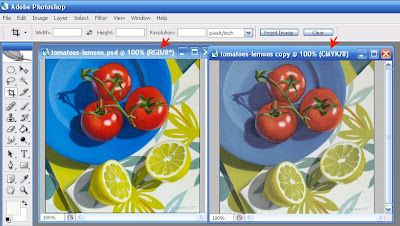
The two basic color spaces, or Modes, that you'll most often encounter with your digital images are RGB and CMYK. Each has a specific use, outlined below.

RGB (Red-Green-Blue) is the color of the light emitted from your computer monitor, and from TV's. Use RGB if you are taking photos specifically to be viewed onscreen, such as the internet, or for a CD or emails. RGB usually also works well for printing from your home or office printer.

CMYK (Cyan, Magenta, Yellow, Black) is the color of inks used in the offset printing process. Use CMYK if you are sending your photo to be printed, such as preparing a postcard to be professionally printed for a gallery invite.
NOTE: CMYK is an option offered only in full versions of Photoshop; it is not available in Photoshop elements or most other photo editing programs (if you know of one, please comment, thanks!). However, if you, if you don't have it, and need to have your files converted to CMYK, do all your edits and then take to a Kinkos or similar shop and they can convert for you).

What color mode is your photo? In most cases, right off of your digital camera, the mode (or color space) will be RGB. You can tell in Photoshop by looking at the blue bar at the top of your open image (see the red arrow).


If you need to change the mode of your image, from the top toolbar click Image/Mode/CMYK.
Changing mode can affect the appearance of your image.
If you switch to CMYK from RGB, you may need to adjust your color. You may notice, as in this exaggerated sample, that the colors in the CMYK sample on the right have become somewhat subdued, especially in the blue range.


For a more thorough explanation of CMYK vs. RGB try this link:
http://www.printernational.org/rgb-versus-cmyk.php

MKRdezign

Contact Form

Name

Email *

Message *

Powered by Blogger.
Javascript DisablePlease Enable Javascript To See All Widget