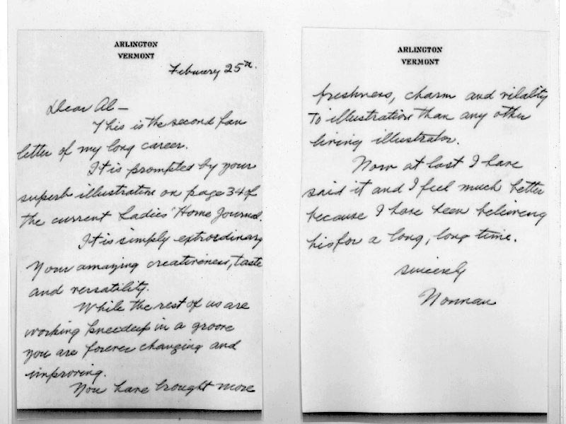
Little did I know that David Apatoff had enlisted the aid of the inimitable Jaleen Grove to hunt down that image at all costs. This past weekend I was surprised and delighted to receive the scans below, along with a note from David and Jaleen:
"Since you are the one who introduced me to the Rockwell letter and you raised the issue, it seems fitting to hand this image back to you to complete the circuit with your readers." wrote David.
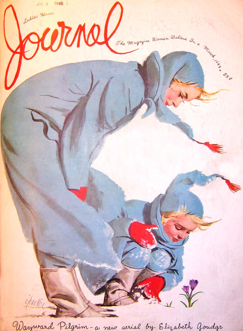
"It is not at all what I expected, and I still want to think a bit about why this particular picture moved Rockwell to write. At a minimum, I give Rockwell credit for being more open minded than I would have supposed."
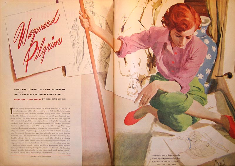
Jaleen added, "I too am wondering what exactly Rockwell was awed by. A strong composition, yes - I like the vase shape echoing the figure - and the radical angle of the pole, and maybe even the model's weird pose - but I don't think I would have paused in page-flipping had I not known about Rockwell's letter."
Jaleen, who has the great fortune to spend some time each month with Walt Reed at the Illustration House, happened to be there at the time of her writing:
"Walt just walked by," wrote Jaleen, "and I solicited his opinion."
"He figures Rockwell had been meaning to write Al for a long time and just found the issuing of this picture to be a convenient moment. Walt says he went to a talk Rockwell gave "quite a few years before" 1948, when Al was just starting out. There, Rockwell praised Al, particularly for the "small things he did" - like that pipe on the window ledge, the odd pose. Walt thinks it looks spontaneous enough to have been done from life."
David brought the discussion to a conclusion with this well-reasoned theory:
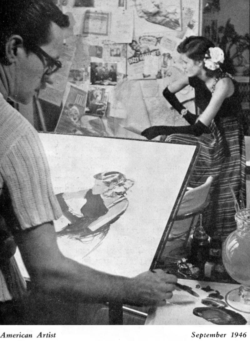
"After a little reflection, I guess I would refine my thoughts on the Rockwell fan letter as follows: By the time Rockwell wrote that letter he had spent nearly 40 years painting with oil paints on large canvases. He worked 6 days a week using a laborious, 15 stage progress with a variety of chemicals and drying agents. Despite Rockwell's magnificent achievement, he must have looked somewhat wistfully at the young Al Parker painting light, spontaneous, unconventional paintings with water based casein and gouache on small illustration boards. I'm sure Rockwell couldn't help but think about all the time he had spent waiting for paint to dry over the last 40 years, and all of the airy brush strokes, such as Parker's, that had been buried in layers of underpainting. The new world of illustration would be one where far less time was spent on implementation and far more time was spent on the imaginative and conceptual parts of the job. I'm guessing Rockwell understood the potential significance of that changing ratio. Parker didn't ask for permission to change the world, he took it. And I think Rockwell must have respected that, too. So perhaps this letter is symbollic of Rockwell's blessing for the future of illustration."
"It's all rampant speculation, of course, but Jaleen and I were both struck by the fact that Parker's illustration didn't seem like the kind of dazzling artistic performance that would inspire the second fan letter of Rockwell's life. On the other hand, if you look at the white space, the stream of pages that integrate the illustration by flowing from the background for the story's title into rough pencil sketches in the illustration itself, the unusual angle on the woman, the conspicuous brush strokes left in place-- Rockwell must have felt like the last neanderthal peering out of the woods at this strange new life form, the cromagnon man standing in the glen. I think it is a measure of Rockwell's quality as a person and an artist that he didn't think, "In my day, artists really had to work..." nor did he think, "If I were starting out today, I could be so much more prolific and have so much more fun...." He didn't even think, "how many brain cells have I lost by inhaling turpentine fumes for the past 40 years?" No, he thought, "what a wonderful, lively new aproach." That's someone who truly loves art."
How about you, dear reader... what do you think?
*ADDENDUM* Tom Watson sent a comment that requires a visual accompaniment, so for those who have been following th]e flow of the discussion, you might want to read the comments section first, then return here to read and consider the following...
Tom writes, "When I saw the Al Parker 1948 LHJ cover, it reminded me of the Norman Rockwell 1939 Saturday EP cover, painted over 9 years before Parker's cover. Both have vignette figures, and both have type designed around the figures. This was quite advanced for 1939, and I'm fairly certain Rockwell designed and lettered the type as he did on occasions for other illustration assignments."
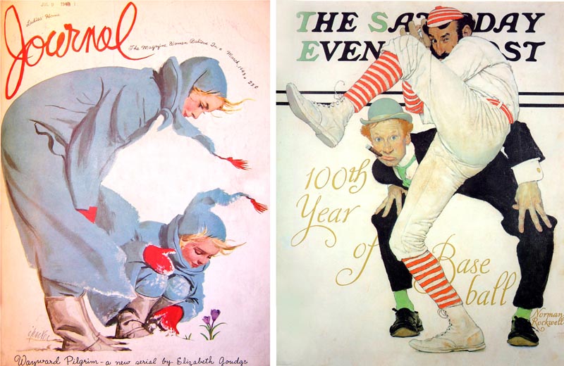
"IMO, it is as innovative in concept and well designed as Al Parker's version. I can't say for sure that Parker was influenced by anything Rockwell did, but this would be a remarkable coincidence, if he was unaware of Rockwell's innovative designing of figures and type, which was not just a one time shot. I think Chad Sterling was accurate in his assessment of Parker's LHJ cover- "The image of mother and daughter for example is very reminiscent of a Rockwell illustration in composition and spirit". I hope you agree with me, that in spite of Rockwell's corn-ball subject matter, his creativity wasn't so behind the times.. for a "Neanderthal". ;-) "
"I think posting the comparisons would be interesting to your viewers."
* There's more to see and read as this week's CAWS "goes wild" at Charlie Allen's Blog
* And the long lost artwork of a Toronto illustration legend is finally unearthed at Storyboard Central
* Finally, with Hallowe'en fast approaching, get in a ghoulish mood with Simon Peng's twisted tale, "Something Gory" at Leifdrawing 101


Post a Comment