HR: In the Beckett illustration you created some time ago, what materials were you supplied with, and what were your instructions?
SK: Well, this happened to be a very happy circumstance. Paramount Pictures is very lenient, and they're open to new ideas. Consequently, all I was given by the art director was a rough, black-and-white sketch that had been approved. It consisted of the two main figures and an indication of the montage.

SK: But in doing a movie poster like this you run into other problems, like billing, where one head must not be larger than the other. Their contracts, I guess, stipulate that both heads must be of equal size, and one must not be higher than the other. Now, if one is definitely the star, he will get his billing. In this case we had Richard Burton and Peter O'Toole, and I believe that Burton in that illustration may be the same size, but I think he's just a bit higher on the page. It probably meant he got top billing.
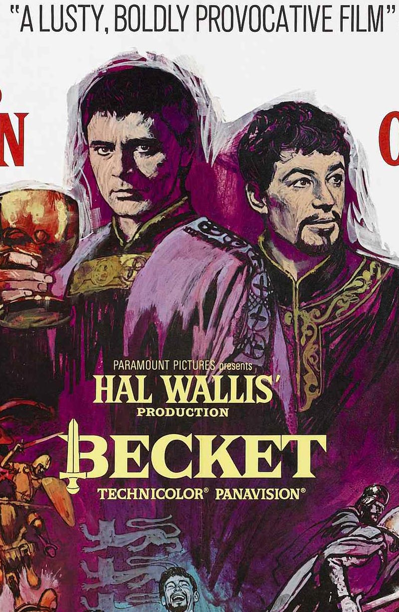
HR: Then movie posters, in a sense, dictate your composition?
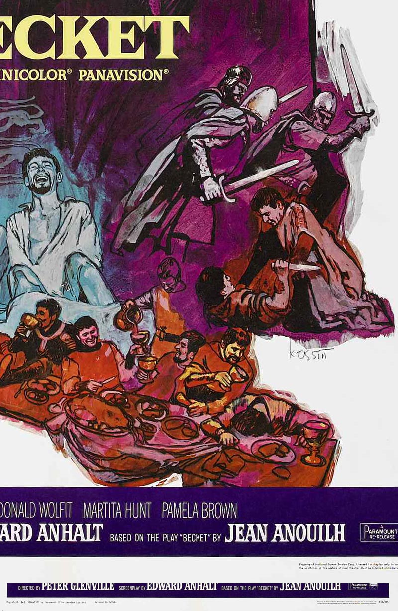
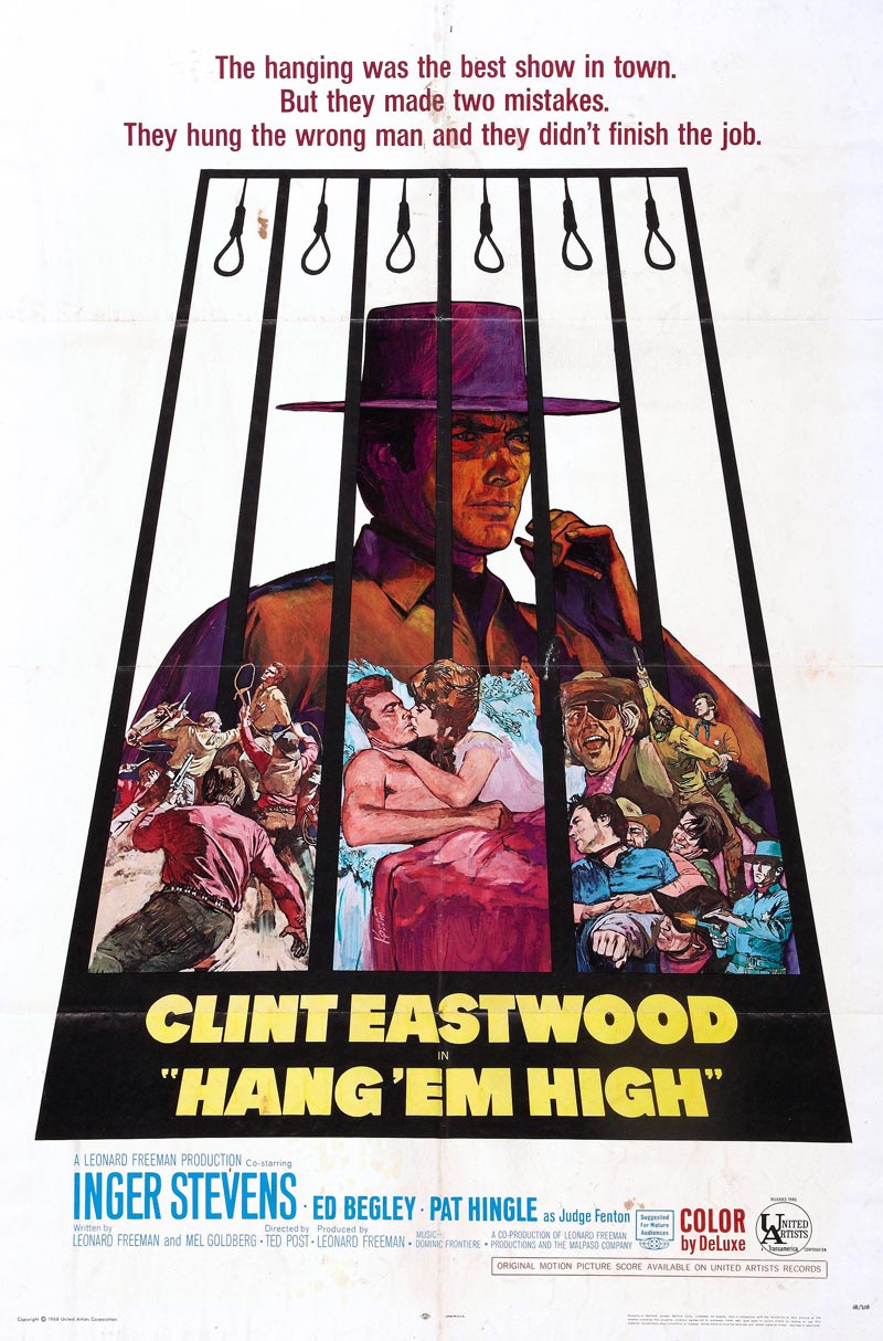
SK: This is what I call my limitations. In the Beckett I presented two large figures of the stars, and around them, in a montage, I depicted provocative scenes from the motion picture.
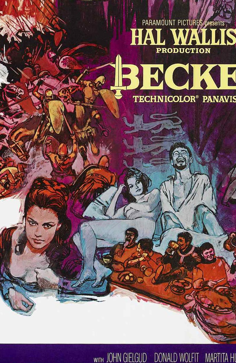
SK: My job was to fill the space in a clever fashion. I received from the movie people many stills that were taken by the photographers on the set. There may be as many as two to five hundred. It takes me a full day to go through them, at which time I may select one hundred or more that I feel will fit into this composition. Another long editing session on my part helps me to select those I feel will be useful to me.
HR: Are these prints in colour?
SK: No, all are in black-and-white.
HR: How do you determine the coloration? Does the art director help?
SK: No, in most cases he leaves that up to my own tastes. In this case, I used purple and blue predominantly, with warm colors running through it, because of the obviously royal subject matter. The hot reds and oranges give a feeling, I hope, of the life and adventure that was basic to this movie.
HR: Sandy, what are those strips of illustration board behind your drawing table? The ones with the color swatches and varieties of textures?
SK: I use them constantly to check relativity of color. Here is a brilliant intense red that goes brown when I place this fluorescent orange next to it.
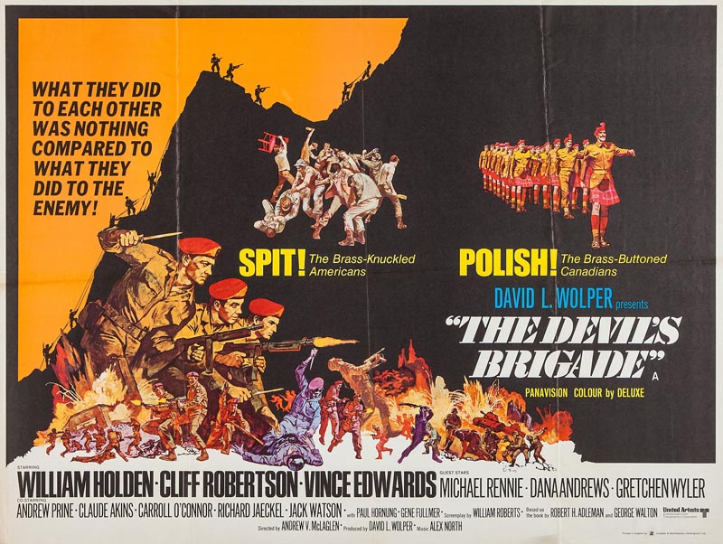
SK: I'd rather rather have it show up here than on my painting. That could be painful.
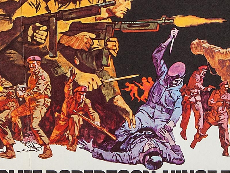
SK: The textures are experiments with modeling paste to see how much impasto I can use without cracking the surface.
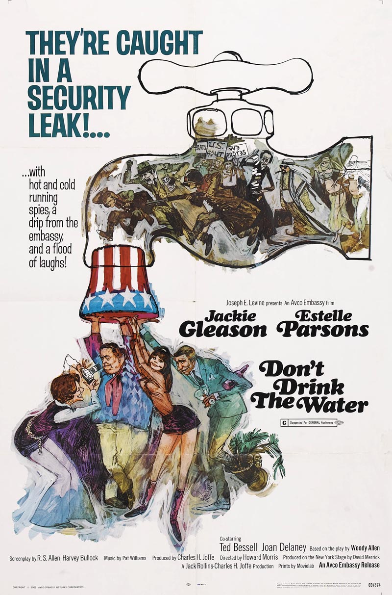
HR: Tell me, do you police the area as you go along or do you save all those little corrections for the end for a general housecleaning?
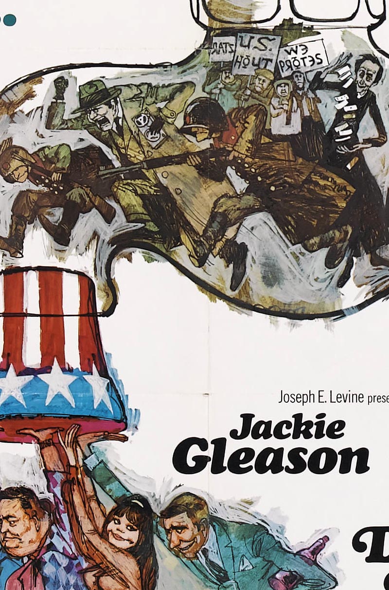
SK: If there's something in my picture that I don't like, I correct it right then and there because each step dictates the next step in a painting. That's why it's so advisable for me not to work on one area and complete it before going on to another. You change and you readjust and it's really a juggling job.
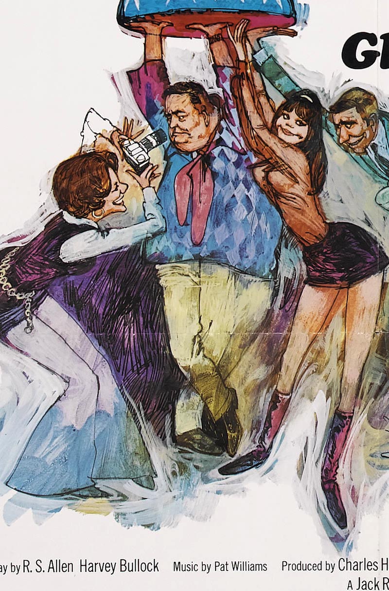
SK: I guess by policing you mean the little nicks, slips of the brush or pen. Sure, I correct those too as I move along. Some of them I leave in, because some accidents make for variety.

* Concluded tomorrow
* Many thanks to Heritage Auctions for allowing me to make use of scans from their image archives in today's post.


Post a Comment