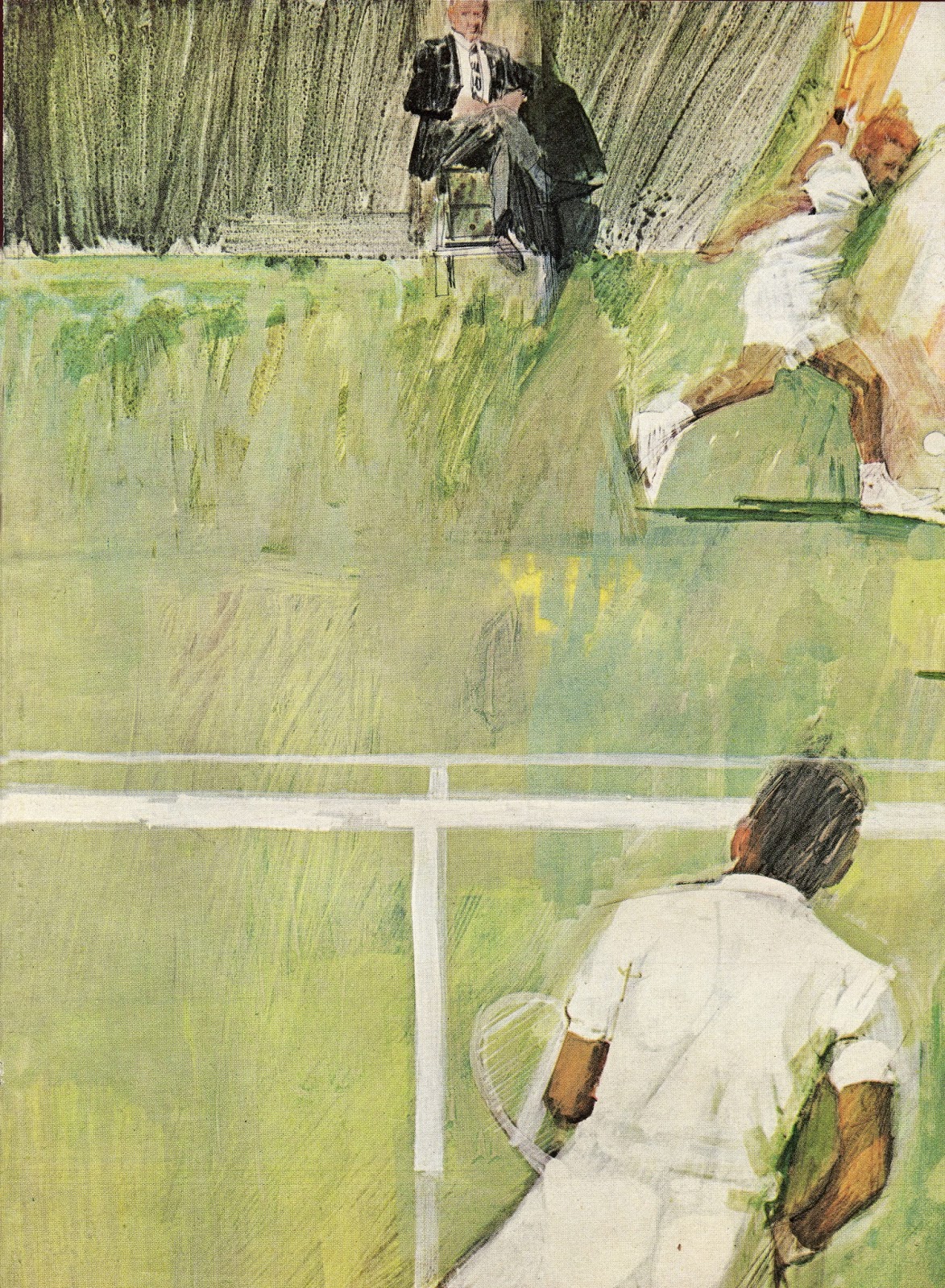
In the 1960s, illustrators suddenly became much better at painting action. Contrast this illustration of a tennis player from 1956...
 |
 |
| Bernie Fuchs for Sports Illustrated |
It's hard to believe two such different approaches were popular just a few years apart. They seem to come from different worlds.
Prior to the 1960s, illustrators often tried to capture action the way a camera did, simply freezing the scene:
Occasionally illustrators might try to get adventuresome with a hotter color or a rougher line, but the results remained pretty tame:
Then at the beginning of the 1960s a radical young group of illustrators came blazing in with new approaches to conveying action:
 |
| Fuchs 1961 |
 |
| Detail |
 |
| Bob Peak 1964 |
 |
| Fuchs 1964 |
 |
| Handville |
These artists found new ways to capture speed by combining fresh ingredients: the action painting and abstract expressionism that were revolutionizing the fine arts world; blurred and multiple images learned from movies rather than still cameras; an increased culture of speed from the new space age; new liberties emerging with the great thaw of the 60s. Illustrators abandoned more static, realistic painting for impressionistic sensations of speed. (As an analogy, recall how the great English painter J.M.W. Turner uprooted traditional realistic English landscapes with his own revolutionary expressionist painting, Rain, Steam and Speed.)
These 1960s innovations were so successful they were quickly adopted as artistic conventions by the profession. The slashing lines and rapid brush strokes that at first seemed so exciting and new became standard tools for illustrators-- so much that later generations sometimes forgot whose shoulders they were standing on. More recent illustrators, particularly those invested in textual or conceptual innovations rather than visual innovations, tend to be more dismissive of this period.
This comes to mind today because in a recent interview a prominent illustrator recalled living in Westport Connecticut among the artists responsible for those 60s innovations:
Westport was ‘the place’, but it became not ‘the place’.... illustration started moving in a very, very different direction. Pretty soon the Westport illustrators looked really old fashioned....[T]here was this big tension between the New York City artists that were trying to be really original and really innovative, and the Westport people that were staying in traditionsI hear this version of illustration history mostly from students or friends of another radical illustrator of the day, Robert Weaver, who seemed to be in a pitched battle with the Westport illustrators when he wasn't in a pitched battle with himself. For me, the notion that "New York City artists" were more "original" or "innovative" falls flat when we compare the impact of the the two schools of illustration. Few illustrators shaped the personality of their era like those bold illustrators of the 60s. And few generations advanced the ball so far from the work of their predecessors.
But the story doesn't end there. Many Westport artists did not "stay in the traditions" that they founded. Many (such as Fuchs, English and Heindel) continued to experiment visually. For example, decades after his 1960s action paintings above, we see artist Bernie Fuchs employing a very different approach: there are no slashing lines in the following pictures because Fuchs later conveyed speed with a more mature combination of distorted forms, color and perspective.
The fact that a New York constituency shifted its gaze from visual innovation to conceptual innovation doesn't mean that the visual innovations stopped happening, or that the gaze won't shift back as audiences hunger for change.


Post a Comment