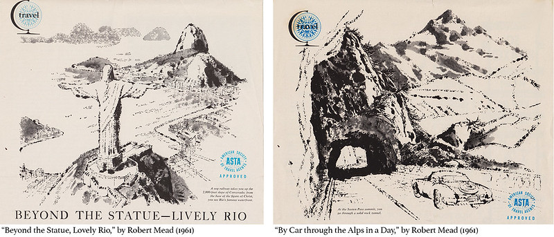
Canadian Homes Magazine had features like travel and gardening still popular features for magazines. Its art director was Art Guest, a lovely gentle man who always had time to chat. They featured a travel spread I enjoyed illustrating and here are two examples:
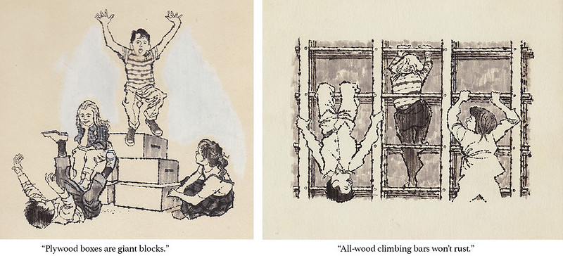
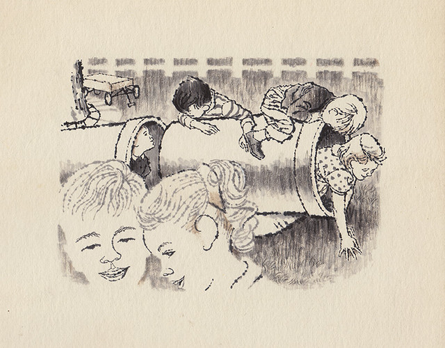
Canadian Homes Magazine was full of ideas for the family. “Backyard Fun for Youngsters,” (1961) was a do-it-yourself article on inexpensive things for kids to play on. Drawing children was a constant requirement for illustrators.
The corporate world needed illustration to embellish brochures, ads, and annual reports, to create a climate of confidence in companies of all kinds. Trade magazines had articles helping industries tackle marketing and employee concerns.
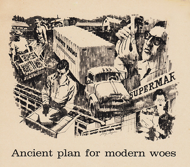
An article on growing produce, processing, packaging, and delivery to supermarkets in one illustration for Executive Magazine by Charles G. O’Neill (1961).
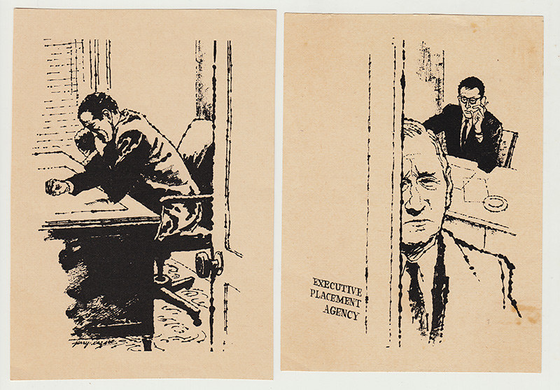
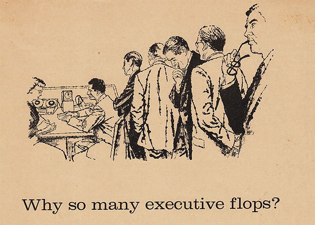
“Why so Many Executives Flop,” by Tony McVeigh, Executive Magazine (1960).
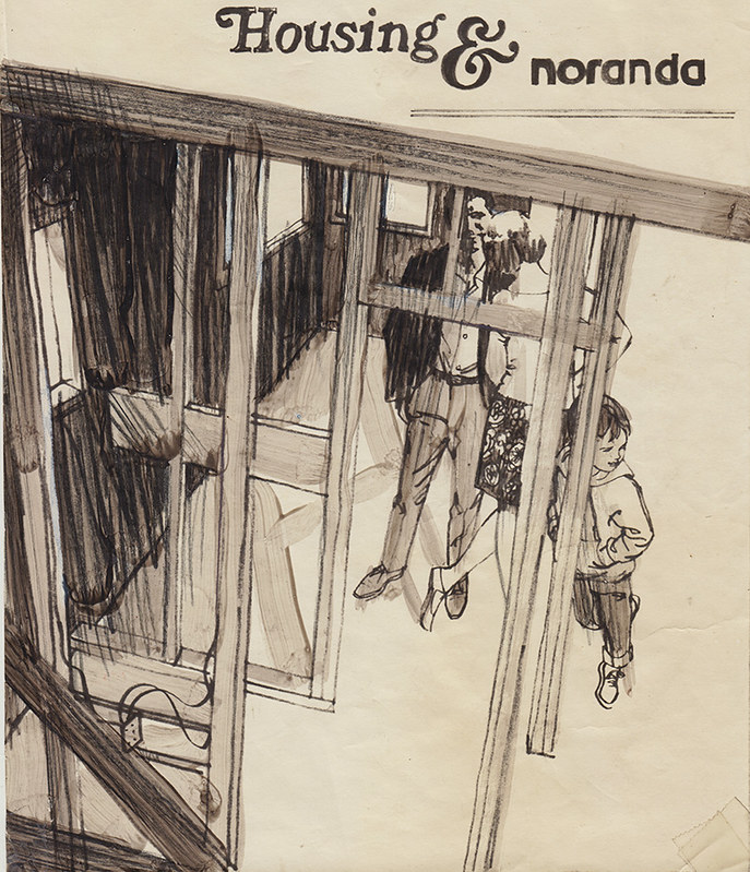
Layout for Noranda on building houses (1960’s)
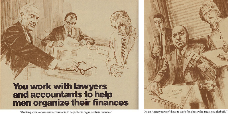
From a brochure soliciting people to work as agents for the Equitable Life Assurance Society of the United States.
My cartooning ability was still an asset as an illustrator. Magazines often used cartoons to illustrate humorous articles and for companies to promote their products.
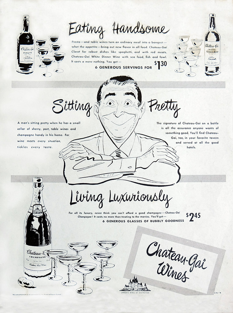
A 1950s Chateau Gai magazine ad done while as an illustrator working at Bomac Engravers.
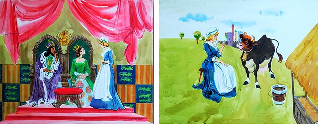
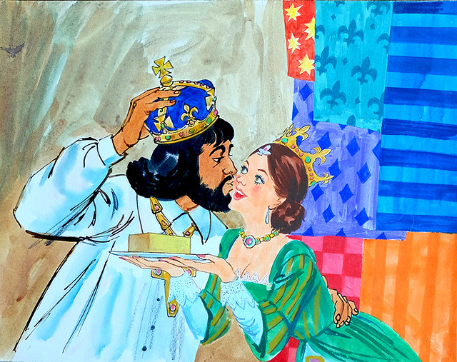
Television graphics for children’s programs were ubiquitous as well. I did numerous assignments for “The Polka Dot Door” TVO Ontario’s award winning children’s show 1971-73.
"The King's Butter," The Polka Dot Door, TVO Ontario (c. early '70s)
4 Favourites
An artist always has a few favourite illustrations that, for some reason or other, pleased him more than others he may have done. This is very subjective and is no reflection on the rest of his work or professional competence. Four I liked especially and why.
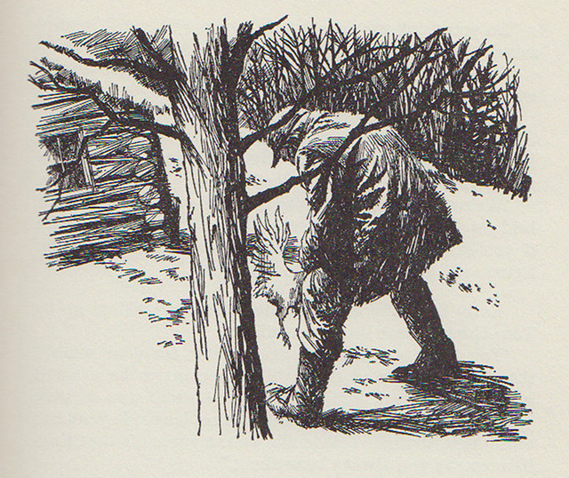
In the McClelland and Stewart book Johnny in the Klondike, two boys watch the villain strangle a chicken. The text reads “Taut with excitement, they watched in horror as the man took the chicken deftly by the neck and gave a quick twist.” This was a bit of a problem. Never having seen anyone actually do this, I had to visualize it. I had a friend act it out minus the bird, which I added later. The arch of his back hid the poor chicken with one leg and tail feathers telling the story and solving a difficult problem. The tree places the boys and reader the right distance from the act.
Johnny in the Klondike, McClelland and Stewart Ltd., 1964
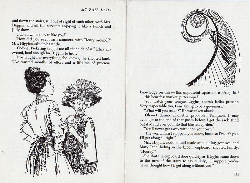
When you’re given a story like My Fair Lady to illustrate, you tend to be a little more focused. The likes of Lerner and Loewe and their adaption from George Bernard Shaw’s Pygmalion challenges you to do your best. Edwardian fashions and the elegance of the plot and charm of the two lead characters Eliza and Professor Higgins are irresistible for any illustrator worth his salt.
My Fair Lady, Four Winds Press, 1967
The final illustration in the book with Eliza and Higgins’ mother plotting to bring him around involved a row with Higgins at the top of a winding staircase shouting down on the two below. By putting Eliza and the mother at the bottom of the left page and Higgins at the top of the right, shouting down across the two pages, I created a feeling of the actual space described in the text.
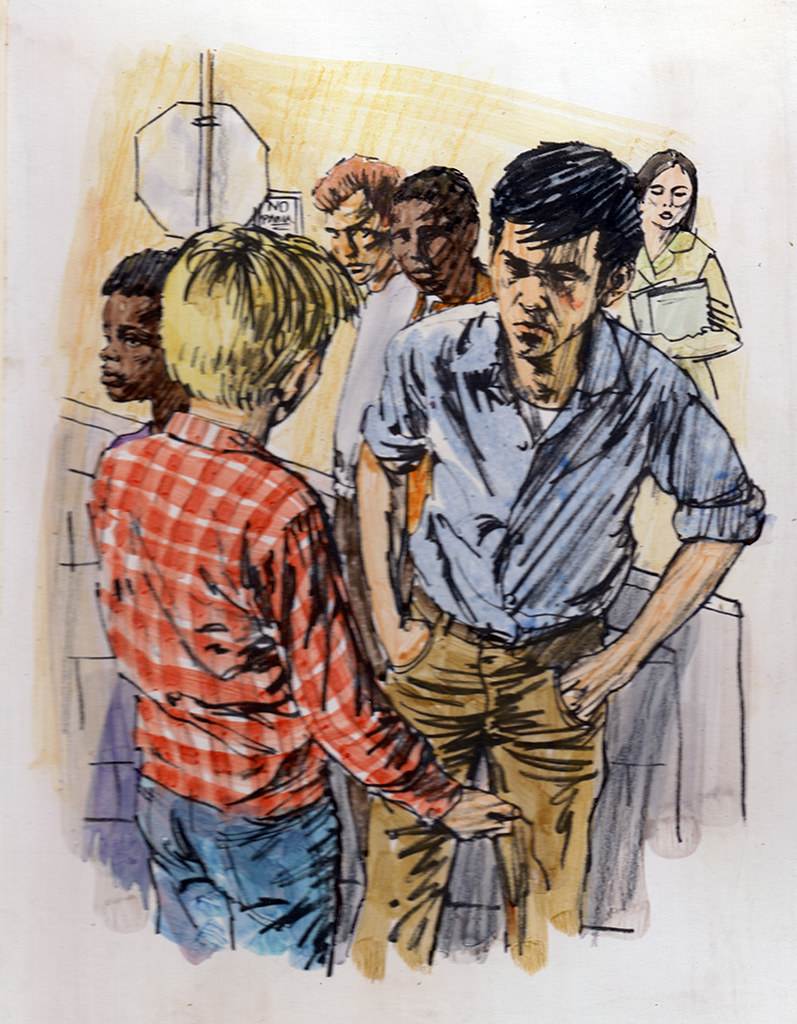
Another assignment from Scott Foresman and Co. was a story called “The Squealer.” It was about a young boy accused of squealing on a very tough gang member who is looking for him to administer revenge. He is approached by the very angry boy in front of his high school and has to plead innocence and convince his adversary. It is the pivotal illustration in the story. After sketching the two boys arguing, I added two other students hearing the commotion and looking over in a concerned way. I felt it added an element of sound to the picture and brought the picture out of the ordinary. I only have the sketch okayed and returned by the publisher for finish. I never did see the published finished art and would love to.
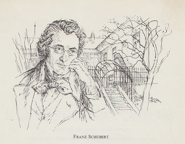
Crosshatch came naturally to me and I’ve always liked things lyrical. The portrait of Fanz Schubert falls into this category. I like it because of its style and mood.
When I was barely a teenager, I saw the work of European painters who were great draughtsmen. Edgar Degas, Antoine Watteau, and Augustus John who attended the Slade School in London that stressed drawing in its curriculum. Edmund Sullivan, the great English illustrator and Charles Dana Gibson, the American, were also early favourites whose work I studied assiduously.
I look back on my 20 years as an illustrator fondly and with great memories. It seemed to go so quickly and when my peers awarded me CAPIC’s Lifetime Achievement Award in 1995, I couldn’t have been happier. Since then I’ve been painting pictures for myself for over 35 years, but each picture, whether it be the comics, illustration or fine art has taken me to another place away from the ordinary world into the wonderful possibilities of the imagination.
Next: From Illustrator to Painter (The Final Step)


Post a Comment