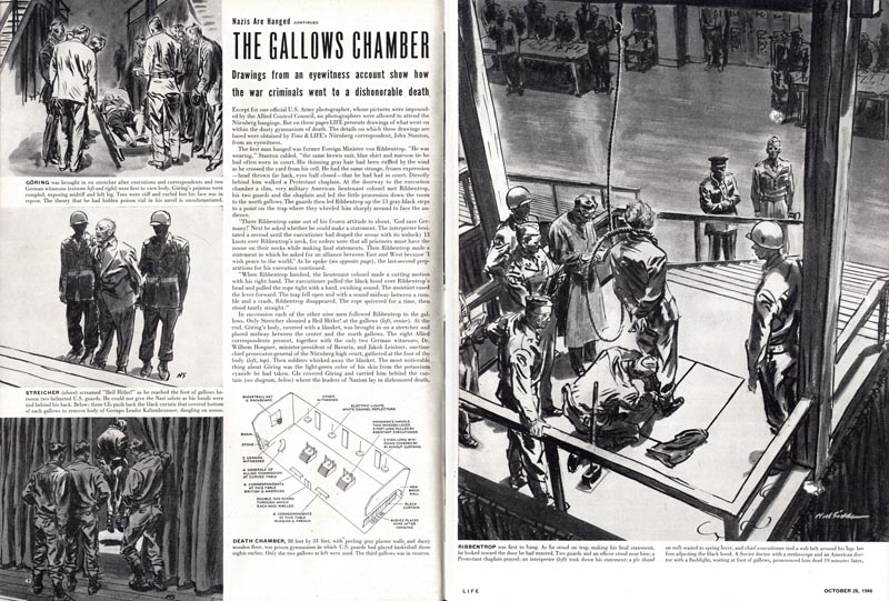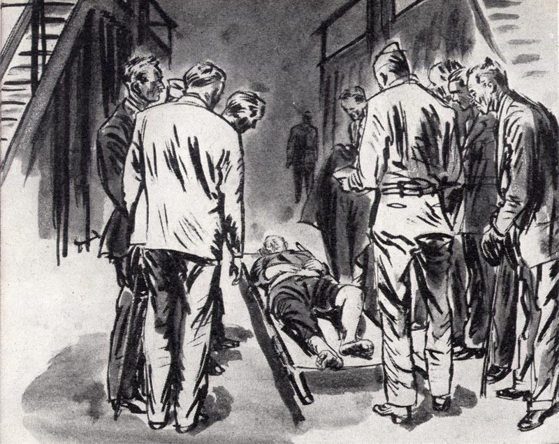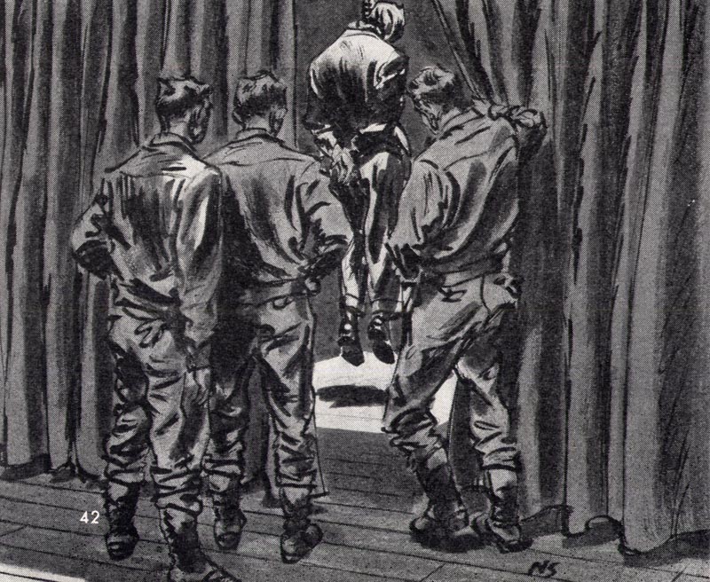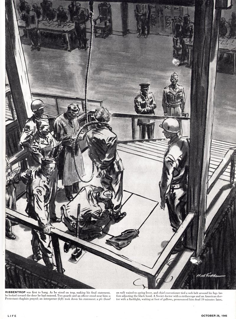
This is truly Sickles at his best. I suspect he had free reign to express himself artistically and the results certainly show it.

Every line, every shape, is a work of art. This is what Robert Fawcett meant when he spoke of work allowing us to conform in some degree to standards we ourselves set, and how the result could "add life and character to the printed page."

Be sure to click on each image to drink in the larger version.

This might be an inopportune time to use such a description, but the quality and expression of Noels Sickles' line in these drawings is absolutely... breathtaking.

Now contrast that work with the scans seen below. They're part of a year-long series of Sickles-illustrated ads for American Airlines that appeared in Fortune magazine.

I'm not saying these ads are horrible but to be kind, they're not much more than pedestrian. I would venture an educated guess that these are ads Sickles didn't have much say in. They look like they were rendered in Sickle's style over agency designed layouts, possibly with heavy handed input from the client.
So why did Noel Sickles do these lame ads? Was Noel Sickles a "sell out"?

I look at it this way: It would be fair to say that Noel Sickles probably got at least $1,000 per illustration for this series if 12 ads in 1951. Here's a neat inflation calculator. Punch in the numbers and you'll see that those ads would have been worth at minimum, about $7,000 each in today's money. I doubt someone of Noel Sickles' abilities would have needed much more than a day or two to render up each ad.
Given the opportunity to make $7,000 for a day or two's work, what would you do?
* My Noel Sickles Flickr set.


Post a Comment