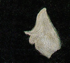
The next design was created by illustrator Dean Cornwell:
So was this one:
And this one:
Unlike Arp, Cornwell put his designs to use in order to achieve something addiitonal:
 |
| Original from the Kelly collection of American illustration. Note the first design in the crook of the man's elbow |
In my view, Cornwell's abstract designs are at least equal to Arp's, yet Arp is celebrated in museums around the world, while Cornwell is not. The reason for Arp's fame is not so much the appearance of his designs but the concepts behind them. As the Museum of Modern Art explains, Arp's designs were part of "a search both for the absolute and also for a new order, following the disorder and chaos of war." Cornwell's designs, on the other hand, were mere illustrations of some potboiler about a sobbing dame.
How should we compare the two artists?
Cornwell's art was able to communicate with multiple audiences at multiple levels, both high and low. Many of today's critics turn up their noses at art that is accessible to "low" audiences; they tend to rate such work at the lowest of those levels. Yet, Shakespeare kept the uneducated crowds titillated with violent melodramas and overheated romances, while simultaneously employing some of the most lovely and elegant prose the world has ever seen.
As for Arp, his claim to "search both for the absolute and also for a new order" may gain him access to certain social venues, but does anyone over the age of 21 seriously believe his designs contribute useful insight to these philosophical problems?
Illustrator Bernie Fuchs referred to this painting as "the picture of the guy with the newspaper." It apparently escaped his attention that the subject of the picture was a young woman breaking down in tears in an office before two officials. But then, it really doesn't matter. What interested Fuchs was the way Cornwell flattened the shape of the newspaper to create an important abstract compositional element with rich colors unrelated to the form, then highlighted it with a graceful white swoosh. That swoosh serves two purposes: an insightful representational feature that restores three dimensionally and a compelling abstract shape.
.jpg)
I've been to a lot of museums, but I've never seen anything by Arp that I like as much as Dean Cornwell's newspaper.


.jpg)

Post a Comment