


Art Directors at publishing houses usually pick the artists for a particular book. Matching the story with the right artist is very important to the success of the book. Frank Newfeld was one of the best, with a very discerning taste in both the commercial and fine arts. When he called me to illustrate the textbook Parlons Francais 1, he definitely did not want a Dick and Jane effort. All the lessons inside were skillfully worked around the activities of an upper middle class Parisian family. He wanted, as I remember, a light sophisticated style with contour drawings like Modigliani.
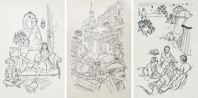
Parlons Francais 1 Longmans, Green & Company 1959
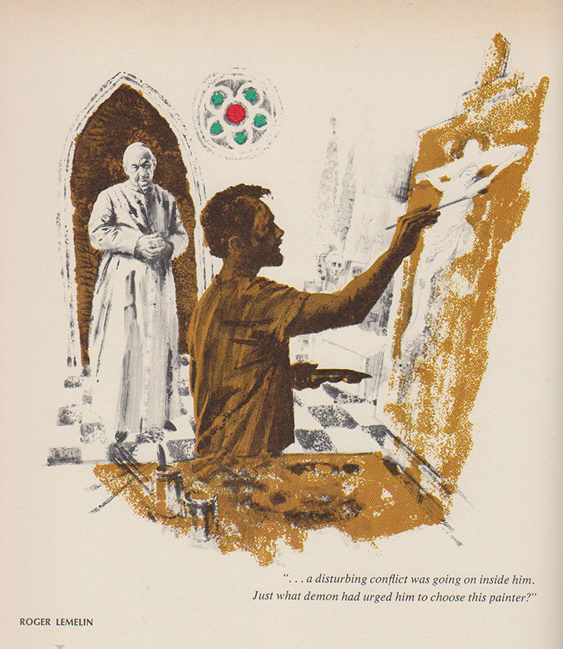
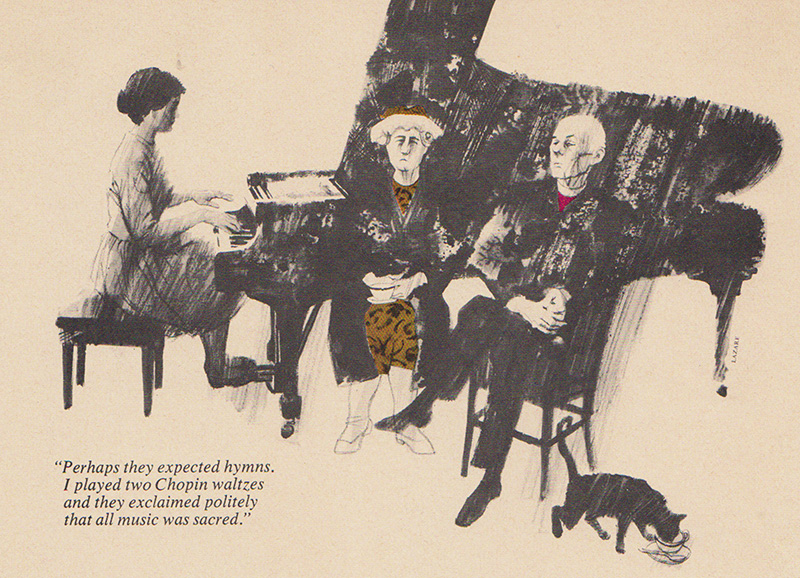
Another assignment from Frank was an anthology of Canadian writers in the Canadian Centennial Library Series by Claude Bissell. The opportunity to illustrate stories by leading Canadian authors such as Ethel Wilson, Morley Callaghan, Mordecai Richler, Robertson Davies and Gabrielle Roy was a dream job. A great Art Director can lift your reputation with lovely commissions like this.
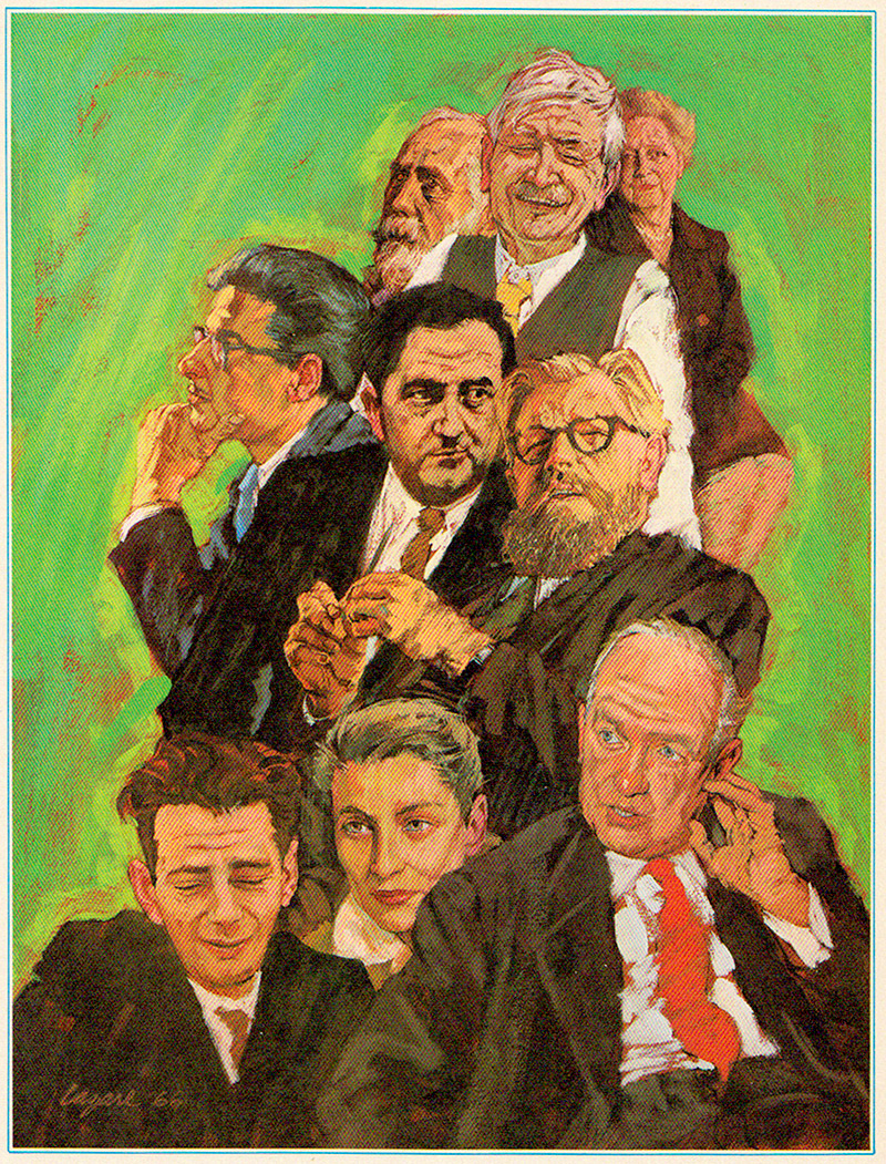
Great Canadian Writing, The Centennial Library, McClelland and Stewart Ltd. by Claude Bissel, 1966. This includes portraits of Roger Lemelin, Mordecai Richler, Gabriel Roy, Morely Callaghan, Robertson Davies, Ethel Wilson, Stephen Leacock, and Brian Moore
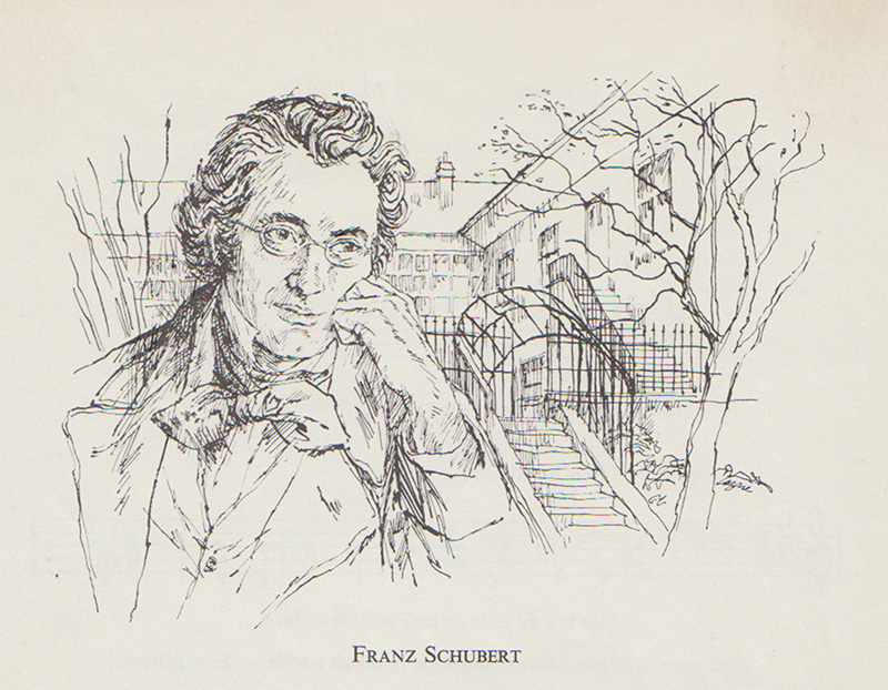
While I’m on the subject of famous people, the ability to get an exacting likeness is an essential arrow in any illustrator’s quiver and it comes up more than you might think. An early lesson in the Famous Artists Course stresses the need for reference material on famous people in politics, theatre, sports, science, music, etc., and they even supplied categories to build a system on. Now I know, as a painter who does portraits, I was helped and prepared by all the assignments I received as an illustrator. Here are a few done for various magazines, books and newspapers in the '50s and '60s:
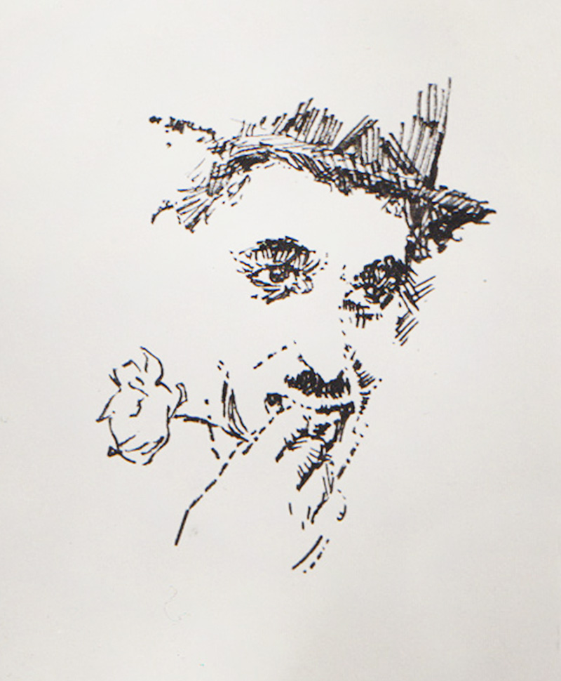
(Chaplin)
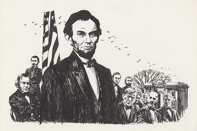
(Lincoln)
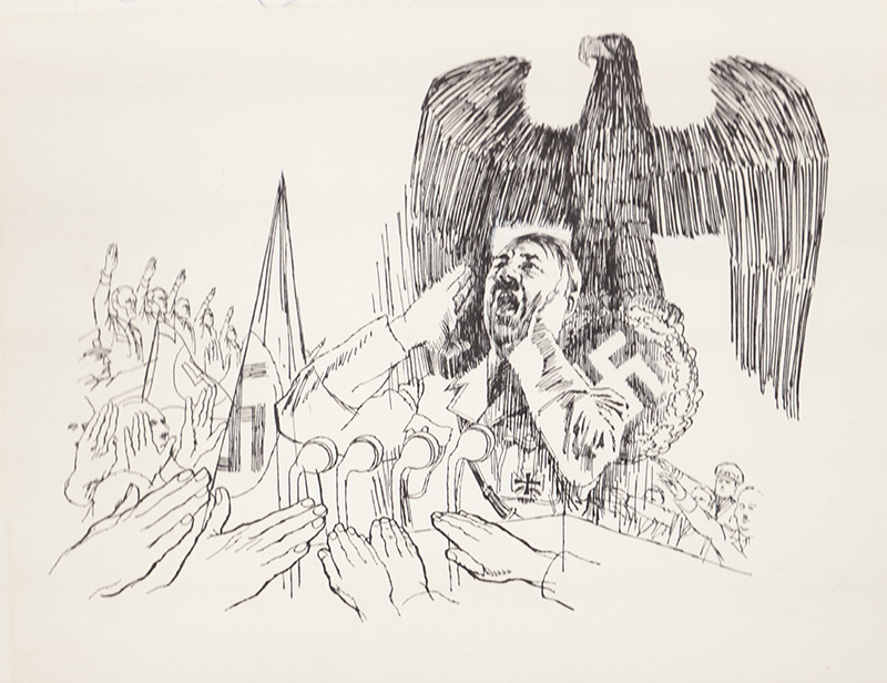
(Hitler)
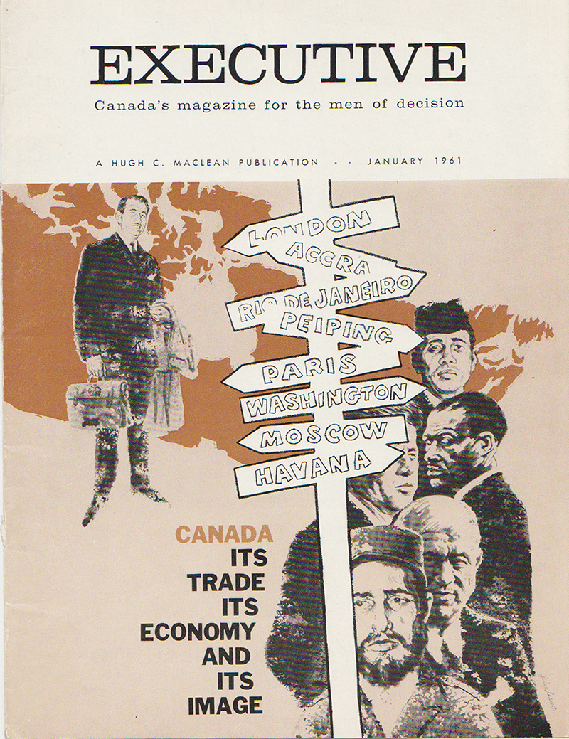
(At the bottom you can see John F. Kennedy, Khrushchev, and Castro)
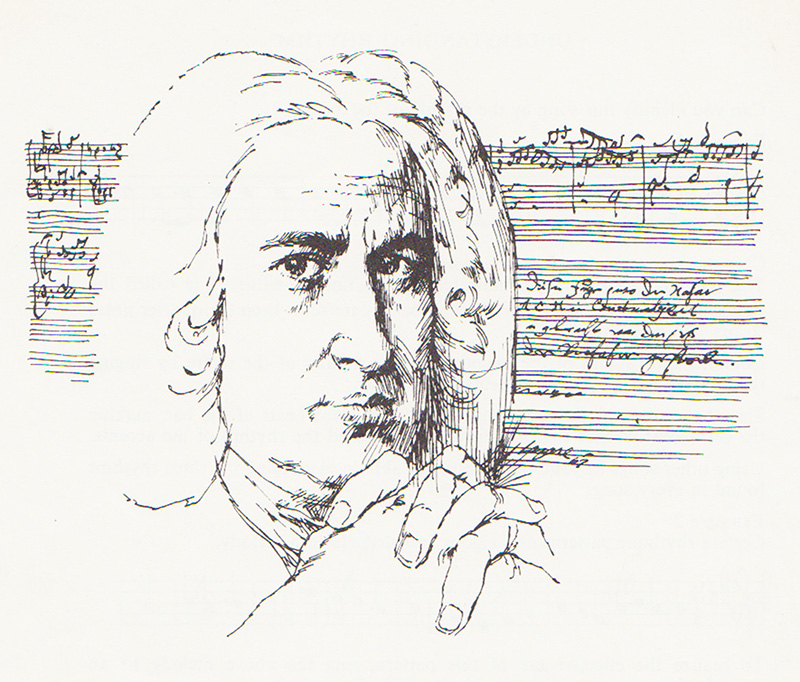
(Johann Sebastian Bach)
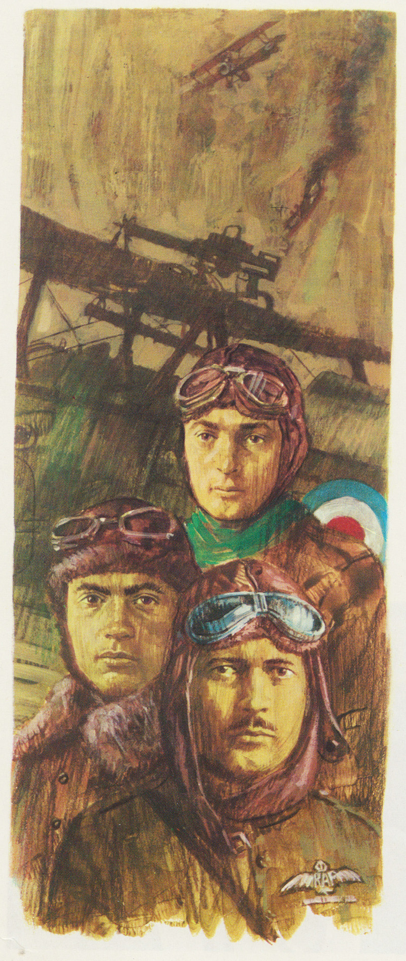
For portraits of people who are not universally well-known like the World War 1 aces below (Freddie McCall, Bill Claxton and Donald Maclaren) photos were supplied to me by the publishers.
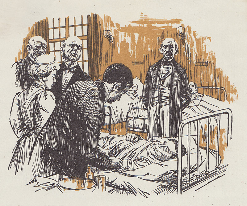
Many high school text books dealt with short stories to encourage reading and language. The stories were often about famous Canadians in all walks of life and Canadian culture in general. For the illustrator it meant a lot of research and often difficult compositions. One such book was “Outward Bound” published by the MacMillan Company of Canada in 1965.
A second colour done on overlays helped to enhance the work.
Sometimes a publisher will want changes. The illustrator then was nearly always required to submit sketches for approval so they could see what they were going to get.
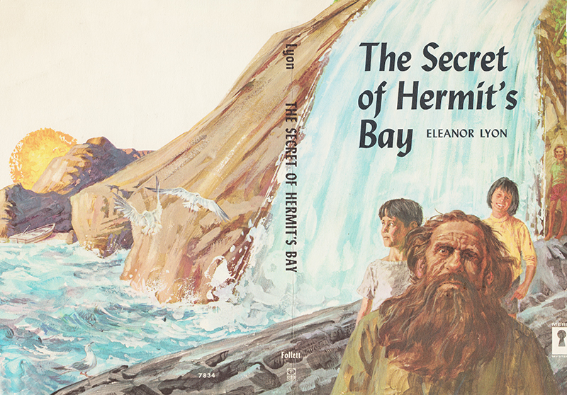
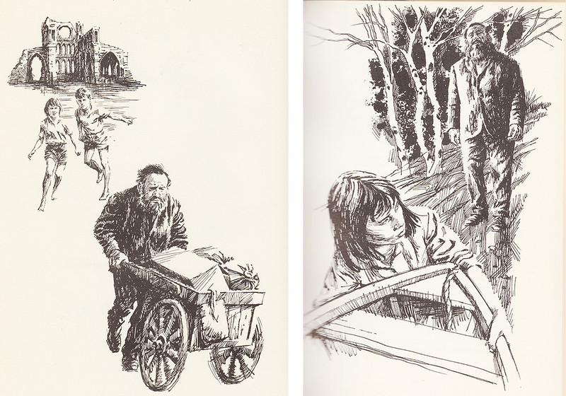
The Secret of Hermit’s Bay (1962) by Elinor Lyon from the Follett Publishing Company in Chicago was one I enjoyed because its title figure Mr. Brown was such a great anti-hero… a scruffy loner who teamed up with three kids to solve a mystery. It also had a wrap-around full colour cover that I could design myself. Mr. Brown was really an anti-hero but sweet underneath it all. On the cover I depicted him as more sweet than menacing and scruffy and the instructions that came back from the Art Director were to “Make him uglier!”
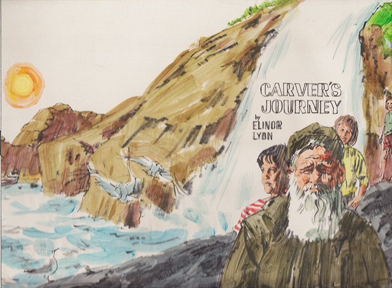
(Initial sketch sent to publisher)
I did and the cover was a big hit and as everyone knows the cover sells the book so I received many more to do.
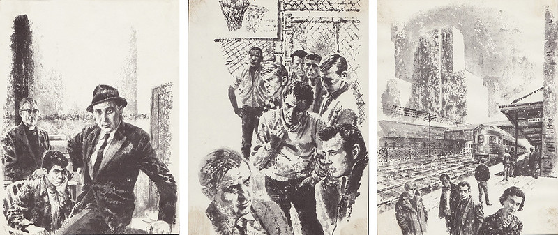
The American Melting Pot agenda required illustrators skilled in depicting urban ethnic populations, so publishers were always after that particular talent. My agent told me they thought I fitted the bill and started to send me tough city dramas like The 23rd Street Crusaders. It was the story of a street gang whose fortunes are changed by an outsider who introduces them to basketball.
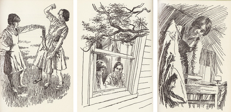
The book that gained me probably the most celebrity was Queenie Peavy (1966) by the famous southern children’s author Robert Burch. I didn’t know it at the time, but he had seen my work in Jean Little’s stories and told his publisher he wanted me to illustrate his latest book. He found me through my agent. The Georgia writer was quite famous with a string of successful award winning books but Queenie Peavy became by far his most successful and was published and re-published in many languages around the world. It won the prestigious Jane Addams Award for both writing and illustration in 1967.
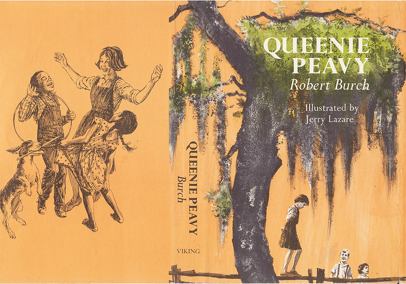
(Viking Press, 1966)
The comic strip work I did in my youth was immediately devoured by its equally young audience and I was recognized for it by many fans right away. When I started my painting career with a series of one man shows many years later in 1975, I received reviews in the major newspapers and art magazines and positive reactions from many generous collectors. But, as an illustrator you are anonymous to the public unless you have a vehicle like The Saturday Evening Post and are Norman Rockwell. Illustration receives little recognition. I think of all the extremely talented men and women of illustration who I knew and whose work I admired and followed avidly in that golden period. Attention should be paid! They should be noted and remembered in our Art History for all they did to brighten our lives.
Continued tomorrow...
Dedicated to the memory of Tom Bjarnason
Post a Comment