
In the 50’s and 60’s magazines flourished. Television had made its entrance but the print medium still remained strong with lots of fiction and articles to make pictures for. A challenging mix of love stories, westerns, crime drama, business, travel, politics — you name it, needed stand-out graphics that would catch the eye.
Many new trends and styles came and went and art directors would often demand new directions and expect you to work in a number of styles.
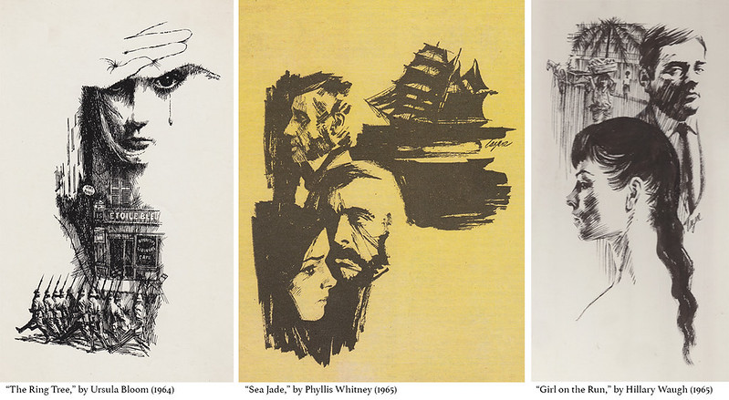
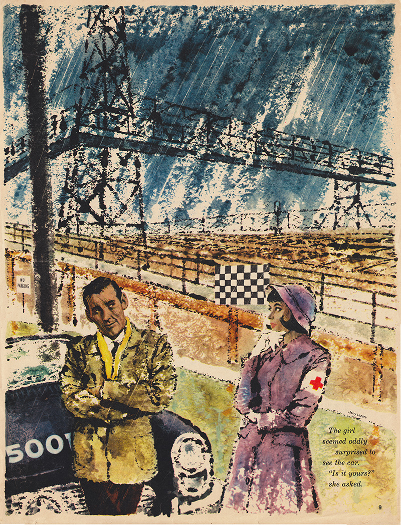
One Art Director who kept my phone humming was Ron Butler with a great smile and easy manner. He was Art Director at The Star Weekly and The Star Weekly Novel, a section of the paper dedicated to fiction. Many great writers had a vehicle for their prose in novella form and they all needed black and white illustrations to embellish them.
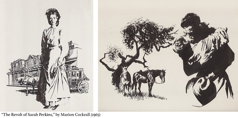
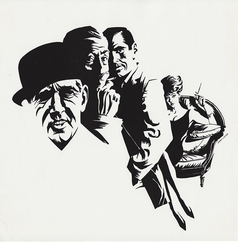
I did many of them for Ron (which you can see both above and below), as did most of the top illustrators of the day. I loved reading the story and choosing a scene to draw and bring the characters to life. Unfortunately few newspapers or magazines contain fiction today. Here are a few more of the Star Weekly illustrations I did for novellas:
“Like with a Preacher,” by Ross Annett (1964)
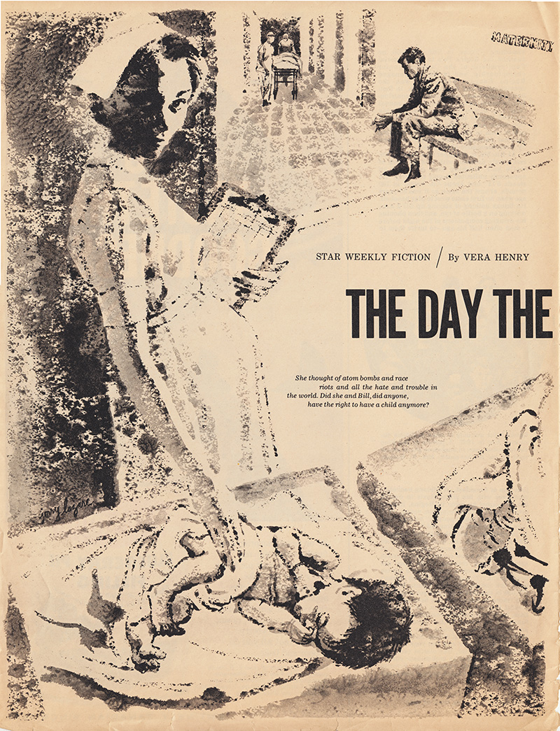
“The Day the Bell Rang,” by Vera Henry (1962)
“Final Judgment,” by Pamela Barrington (1964)
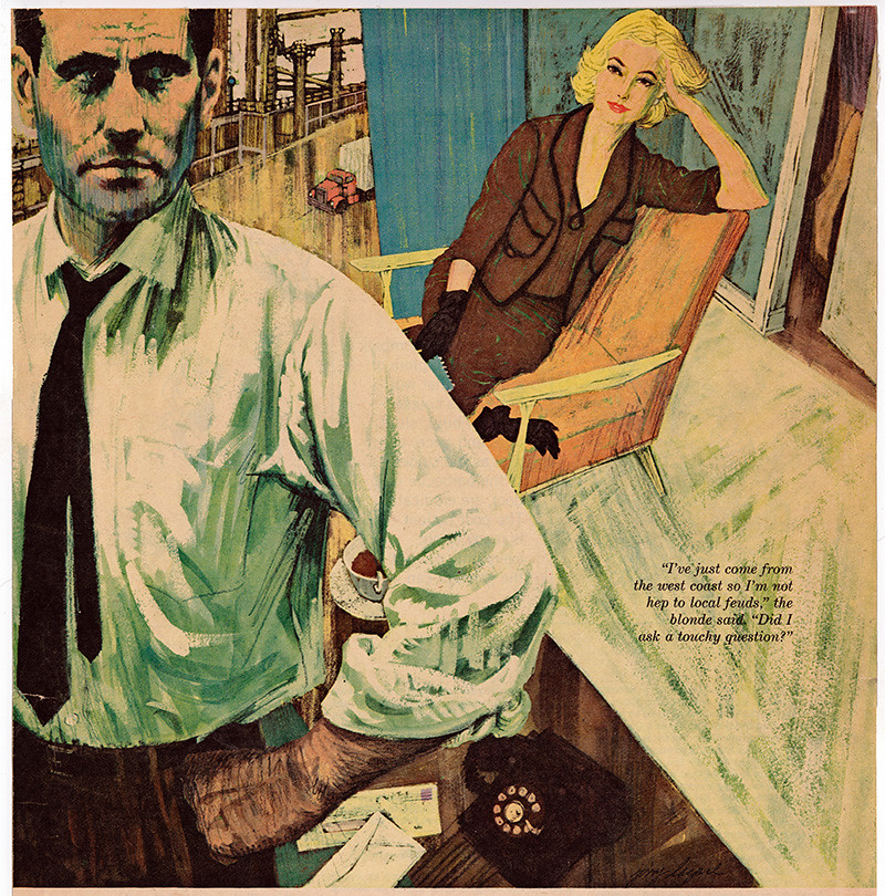
Liberty Magazine, owned by flamboyant entrepreneur Jack Kent Cooke, specialized in articles on Canadian crime, Hollywood gossip, disasters, and often paradoxically enlightening stories on Canadian history by Frank Rasky, who also art directed. The Canada policy was highlighted by city names in their titles, such as: “The Vancouver Killer who Trusted his Wife,” “Curious Case of the Murderous Halifax Doctor,” or “Montreal Darling, Cheating Honeybunch, I’ll Murder You.”
“The Psychiatrist who Caught his Patient’s Craze,” by Dr. Robert Linder (Liberty Magazine, 1956)
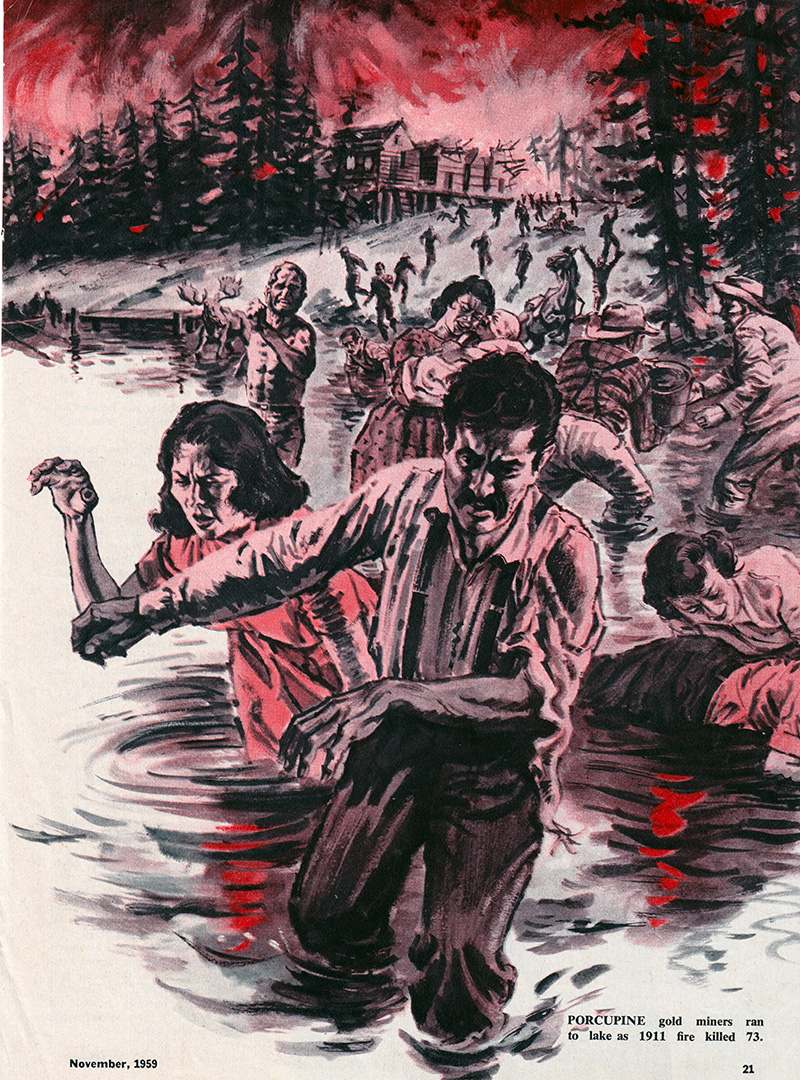
“Ontario’s Two Wildest Forest Fires,” by Frank Rasky (Liberty Magazine, 1959)
Hugh Garner, the legendary writer wrote for the magazine and I met him at Liberty Magazine while delivering work, in the same way I met Pierre Berton at publishing houses. When I look back one of the advantages of being a freelance illustrator was all the interesting accomplished people one gets to meet when delivering your work to the offices of clients. Some of them become friends and enrich your life in myriad ways.
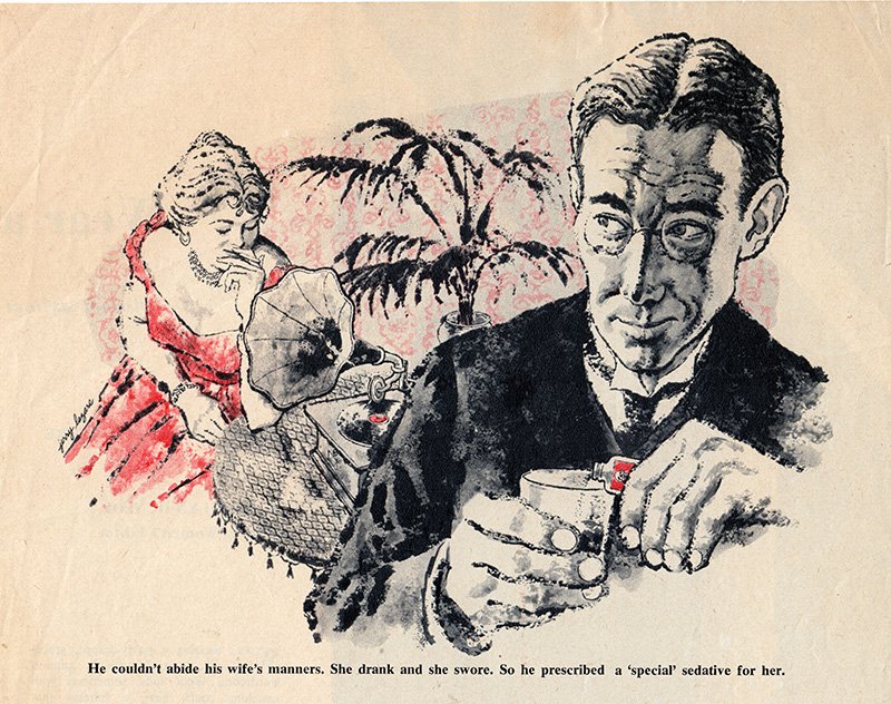
“Curious Case of the Murderous Halifax Doctor,” by Alan Hynd (Liberty Magazine, 1960)
A constant dilemma of being an illustrator is the transition from your original art to the reproduction. Your audience never sees the original, but only it’s reproduction on the page.
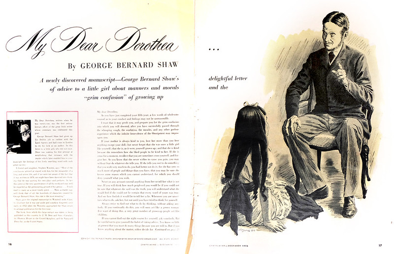
“My Dear Dorothea,” by George Bernard Shaw (Chatelaine Magazine, 1956)
Before the digital revolution, technicians working on a press with inks, paper, and plates, would pull proofs prior to reproducing your art. The Oxford Dictionary definition of ‘proof’: “printing a trial impression taken from type or film used for making corrections before final printing.”
“Yellow, Yellow, Catch a Fellow,” by Margaret Flynn (Canadian Home Journal, 1957)
Depending on many factors, but mostly the skill and dedication of the technicians, the reproduction could be very true to your original or a mess that would make your heart drop. Often it fell somewhere in between.
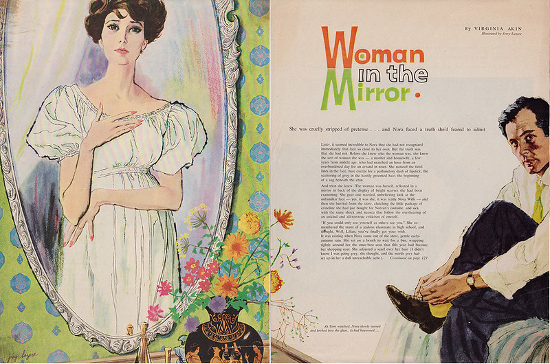
“Woman in the Mirror,” by Virginia Akin (1959)
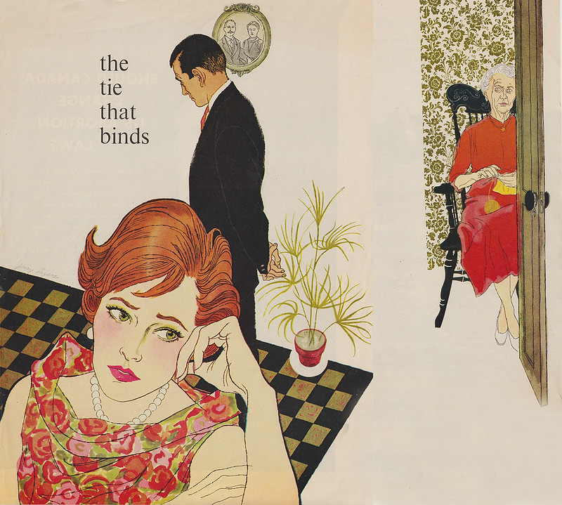
“The Tie that Binds,” by Loretta Burrough (1959)
It depended on the art director to okay the proof and thus the final reproduction. One art director who cared about quality was Gene Aliman at Maclean’s Magazine. He was a no-nonsense, serious perfectionist. I often saw on his desk proofs from the painter marked with hundreds of written corrections for the printer to follow. Below is a very early illustration done in 1955 for Maclean’s Magazine. It showed my love for Albert Dorne’s work. His style was very animated with a strong line approach and washes of coloured inks floated on top. He also was an excellent draftsman and this showed up in the way that he drew hands.
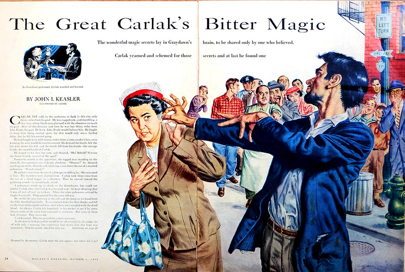
“The Great Carlak’s Bitter Magic,” by John I. Keasler (1955)
Later, with my love of painterly illustrators and fine artists, my style became more opaque and painterly.
Continued on Friday...
Post a Comment