


"Even though Whitcomb 'knocked out' the figures in his column compared with those his story illustrations, they show the same glamour and much of the same flair. I think that he was incapable of drawing a less than beautiful girl or handsome man. Even his Arthur Godfrey looks close to handsome."
To which I must add, its the fact that the art in Whitcomb's columns are 'knocked out' that gets my juices flowing! As accomplished as Whitcomb's story illustrations are, I've always found them to be a little ... overwrought. A bit too perfect -- and subsequently, a little static.
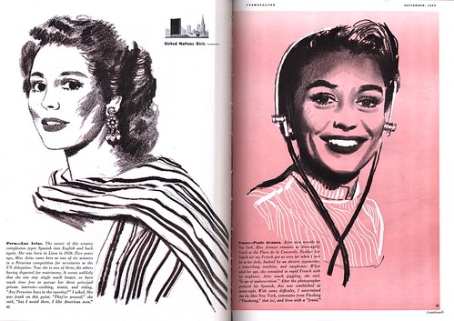
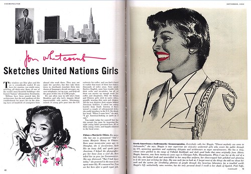
The work Whitcomb produced for these Cosmo articles shows a keen sense of simplicity and their stripped down appearance lends them a wonderful vitality!

They contain the energy of a first stage rough - an energy many of us who work in illustration feel is lost by the time we get to the finished product.
Jon Whitcomb Flickr set
Post a Comment