


Another fantastic thrift shop find, The Highlights Handbook, illustrated by Jerome Weisman is an absolute treasure trove of wonderful illustrations.
I have never heard of Jerome Weisman... and as is so often the case, my internet search results turned up nothing. But my gosh, what a beautiful touch he had!
This book dates from around the mid-1960's, as far as I can tell. However, the style Weisman employs throughout this volume is a bit reminiscent of of the sort of look you might have seen as early as the mid-50's. Weisman seems to be riffing on a cross between Austin Briggs and David Stone Martin.

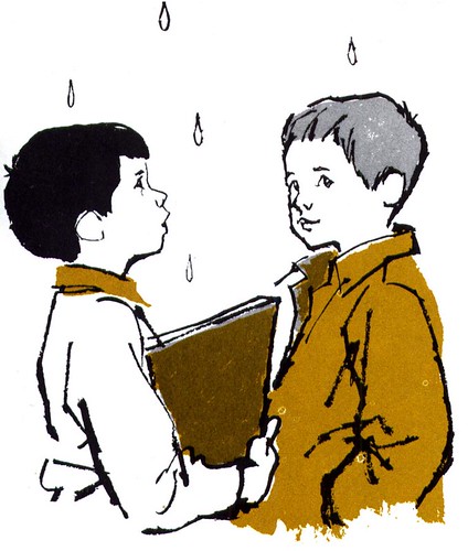
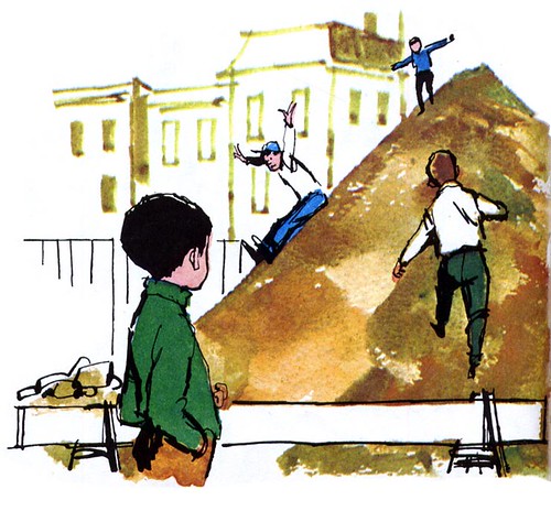
Many of the most exciting pieces could actually be easily overlooked because they are just small spots, like the one I've blown up below.
Here, Weisman nicely utilizes a combination of line and shape - along with an extremely limited colour palette - to great effect. Its a shame that this sort of approach to illustration has mostly fallen out of favour. I suppose at some point it was considered to have become a 'dated' look...

... personally I think its got a visual appeal, a cleverness, I never grow tired of.
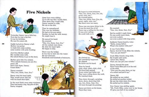
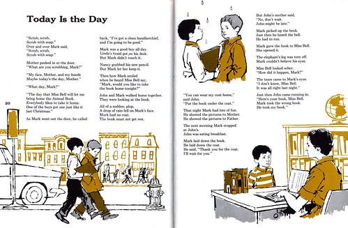
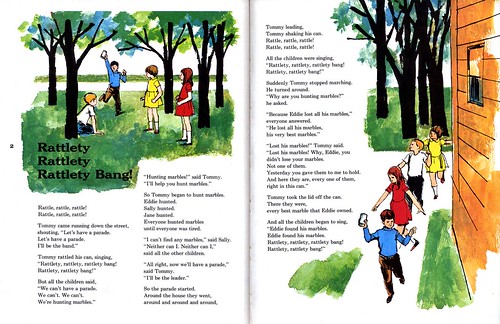
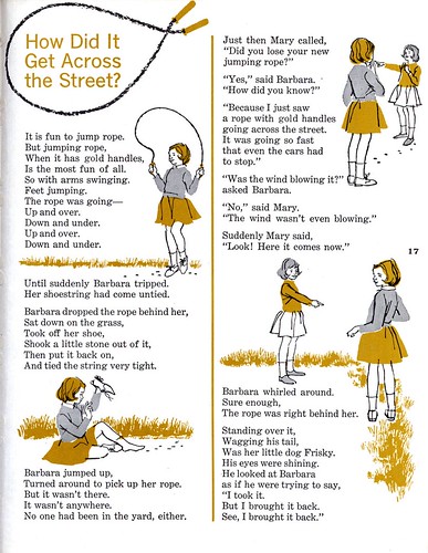
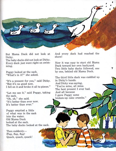
Not to short-change Weisman for his full colour pieces.
There's a wonderful freshness and energy - as well as a nice sensitivity for his child subjects - in these bright, quick watercolour-and-ink-line studies.


Will we ever learn more about Jerome Weisman? Only time will tell.

For now, take a little break from your day and enjoy studying these images in greater detail. Go to my Jerome Weisman Flickr set and click "All Sizes" above each image to see the full size version.
Post a Comment