


Still, its a little surprising that artwork like this had penetrated far enough into the popular culture that it was considered entirely appropriate for an audience quite a bit less sophisticated than that of , say, Fortune magazine or Esquire.

Marvin Friedman, born in 1930, had studied under Henry C. Pitz at the Philadelphia Museum School of Art before beginning a career in illustration that found him working for most of the major magazines in what Walt Reed, in his book, "The Illustrator in America", calls "a direct, reportorial manner."
I would go one further and add, "with a heavy dose of vigorous, expressionistic influence".
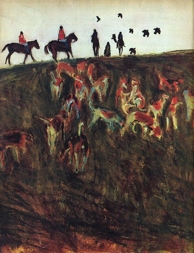
To me, Friedman's work is a good example of the middle ground between the radical fringe of Robert Weaver and the commercial acceptability of Bernie Fuchs or Bob Peak.

Not to put too fine a point on it but there is enough literal interpretation in Friedman's work here to make it more palatable to a general audience than there is in Weaver's art. But it still isn't as pretty or idealized as the work that Fuchs and many others from this period were producing.
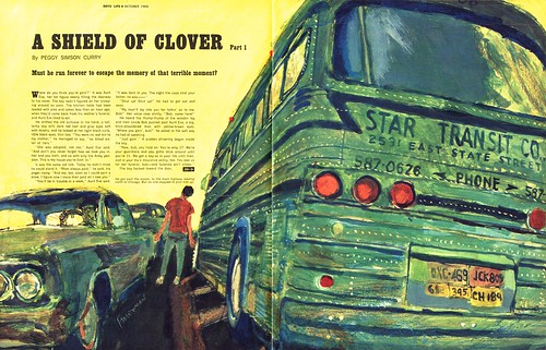
The thing all of these artist had in common was that they were exploring ways to differentiate their work from that of the photographers who were capturing an ever growing share of the assignments. With that in mind a piece like the one below, which might initially be dismissed as looking like nothing more than the early stages of an underpainting, takes on a new light.
And this is the great contribution of the avant-garde movement: this first wave set illustrators free to explore their potential, to create the most honest work they could make and, hopefully, to enlighten and inspire art directors to see the merit in illustration as a still viable communications tool.
There is a wonderful collection of Marvin Friedman's later work at Marvin Friedman.net
The images can be viewed at a nice large size so you can better appreciate their complexity and detail.
My Marvin Friedman Flickr set.
Post a Comment