


This final day of observing Daniel Schwartz’s bold innovative illustration style, emphasizes the consistent quality he displays in every assignment. Schwartz the fine artist, and Schwartz the illustrator, effectively unify without conflict or incompatibility.

The above illustration, probably done around 1960 or 61, for a story in McCall Magazine, is one of my all time favorites of Daniel Scwartz. For me, it has all the ingredients... interesting composition, nice mix of warm and cool colors, mood development and exciting surface texture. His soft overall color scheme, with a woman deep in her own thoughts, sets the mood for this intriguing illustration. Schwartz uses his effective combination of thin oil washes and opaque lighter values to define shape and form in a collection of nostalgic elements. Notice the very loose sketchy treatment to those elements, while the figure is given more clarity and importance. During the 1950’s and before, this would more likely be the appearance of the color rough submitted for final approval. But, Schwartz uses his fine art influence and experience, in making it work as the finish. One of the radical changes in illustration was an evolution from accurate defined literal interpretation, to spontaneous expressive brushstrokes, enhancing the mood, and giving it a poetic atmosphere.

This was a courtroom assignment for Life Magazine in 1971 for the military hearing of Lt. William Calley Jr’s account of the Mylai massacre, during the Viet Nam War. With his varied capabilities as a fine artist / illustrator, it is not surprising to me that Schwartz was selected to illustrate these hearings. This becomes an ideal assignment for an illustrator, since photographers and video cameras are generally not permitted. This was a very high profile hearing, and obviously the assigned illustrator cannot purposely inject his personal feelings into the illustrations. The challenge is to be objective, and record the essence and general mood, transporting the reader to the event.
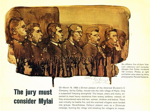
These transparent watercolors became the defining technique that Schwartz adopted, in the late 60’s. I don’t recall other high profile illustrators using this particular technique at that time, and if there were some, they put their own spin on it. The first illustration is quite complex, depicting the whole court room, displaying the key players... then shown above, he uses a vignette depicting profiles of six officers to hear the accounts. The well defined features, with astringent expressions, reflect the seriousness of the hearings. Schwartz artistically allows his paint to drip off the bottom edge of each illustration... an effect that was virtually not seen in illustrations, to my knowledge, prior to 1959 or 60. The drips effectively break up the hard edge bordering the illustration... a technique, not uncommon with fine art watercolor painters.
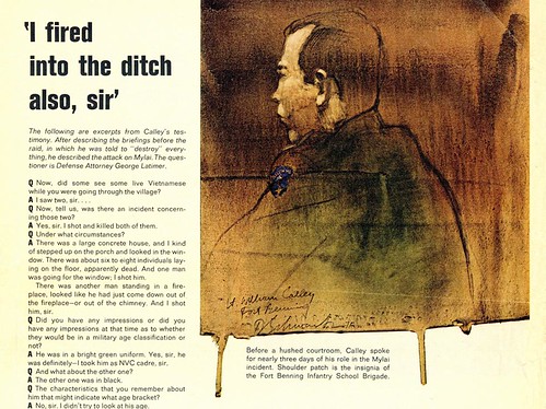
The illustration above is a good example of Schwartz’s ability to sketch on the spot, with a combination of accuracy and artistic flair. This is journalistic illustration at its best, in my opinion. As depicted in yesterday’s posts of the “Fallen Angels”, Schwartz was no stranger to sketching on location, and from what I gather from very good sources, he preferred that direct contact. His use of color in these last 2 spot illustrations, is limited but quite effective. They remind me of graphic sketches of the old masters, with their casual sepia tone washes... which no doubt Schwartz was quite aware of.
After the 70’s, I don’t recall seeing his illustrations in magazines, but he is currently doing easel paintings for galleries, and it appears he has gone back to oils, depicting less detail. Click the URL below, and you can see examples of his work today: Daniel B Schwartz.com
Post a Comment