


"Weaver let what he saw influence his design, whereas Peak, and Fuchs to some extent used photos of life to fit their designs. Weaver drew a lot of what he saw outside his studio, where Peak traced photos and jazzed them with an airbrush and pastels. Don't get me wrong, Peak was a great thinker... but for me, his work lacks any depth, exploration, or lasting feeling."

Really? Is that how we can sum up Peak's work? Just some jazzed up photo tracing, lacking any lasting depth or feeling?
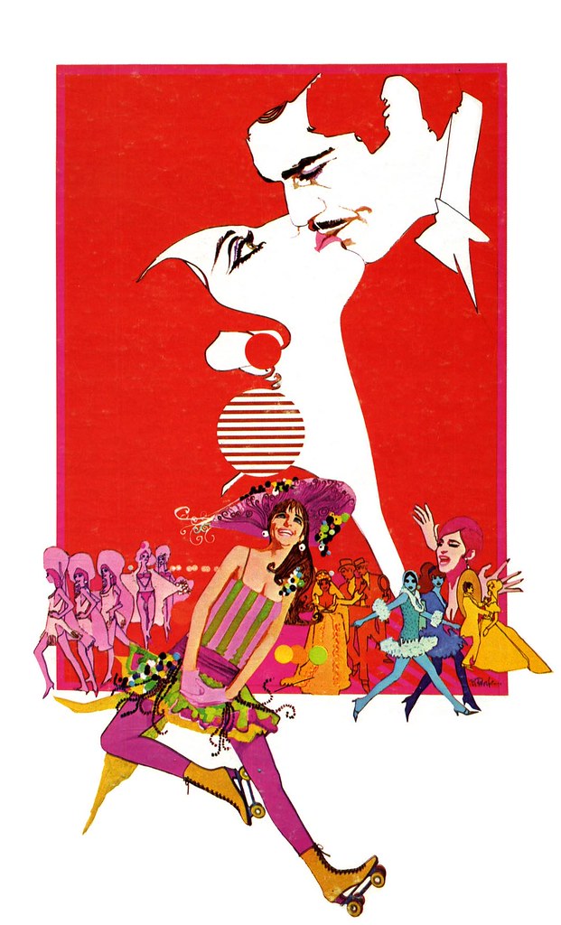
In the late 60's, Bob Peak began a new way of working. Where his early illustrations had a tremendous degree of texture and a sort of wildly gestural quality of movement, now Peak applied his always brilliant sense of design and colour and tempered them in a style that gave a nod to the 'psychedelic' counter culture pop art movement of the day.
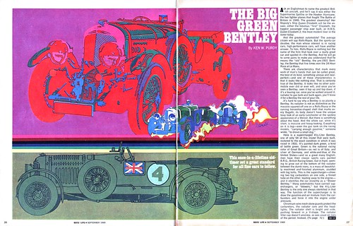
During this period, Peak was producing exciting new work with tremendous confidence that propelled him to the front of the pack. He received a Gold Medal from the Society of Illustrators in 1967 for his movie poster art for the film Camelot (you can see that image on the front page of bobpeak.com)
In his article in Illustration magazine #6, Thomas Peak, the artist's son, writes:
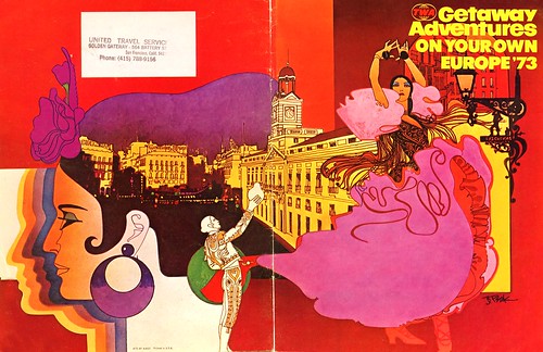
In 1973, Charles Butler Associates commissioned my father to do a series of murals for the backs of the TWA movie screens. The murals met with rave reviews from Charles Butler Associates and TWA, which led dad to do a series of menu covers for the airline. He continued to produce artwork for other TWA publications like the Getaway Adventures guides [below] with their wrap-around cover designs. This artwork was more sophisticated and subtle than the murals, but kept with the same basic design scheme and look that Bob had produced from the original four murals. Over a period of two years, dad illustrated 60 pieces for TWA. These works gave him a tremendous amount of exposure, and enabled him to receive broader media exposure through such publications as North Light magazine and Communication Arts.
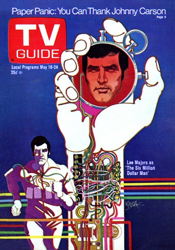
The commercial artist faces many challenges in the effort to make a successful picture. A balance must be struck between the client's needs and the desire for artistic expression. To attract a broad audience, the image needs to acknowledge current tastes - and then, hopefully, push some boundaries... even if only a little. I have the greatest admiration for any artist who is able to combine all of those variables to produce truly remarkable work that appeals to a great many people. They lead the way for other artists by inspiring them to think differently about their own work. Bob Peak was one of those artists.
Charlie Allen, who provided many of this week's scans, summed it up nicely in a email he sent me last night:
"Peak was quite a talent. There are leaders and followers in every field of endeavor it seems."
* I have many people to thank for assisting me with this week's topic: Barbara Bradley, Charlie Allen, David Apatoff, Tom Watson for their advice, opinions, information and scans, and Dan Zimmer for allowing me to excerpt passages from Tom Peak's article in Illustration magazine, which are ©2003, 2008 by Tom Peak, Dan Zimmer and The Illustrated Press, Inc., and all artwork © The Estate of Robert Peak.
* NOTE: Because of the tremendous volume of material that was provided to me in preparation for this week's topic, I'll continue to post over the weekend.
There is much, much more on the artist at Bob Peak.com
My Bob Peak Flickr set.
Post a Comment