


After all, could the mid-50's Bob Peak have sold a client on the idea of a green man drawn in a distorted style as the best way to advertise their product? I don't think so.
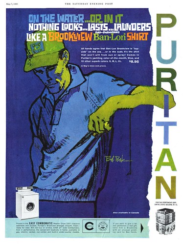
But at last times had changed, and all of a sudden Peak's signature - and signature style - seemed to be everywhere.
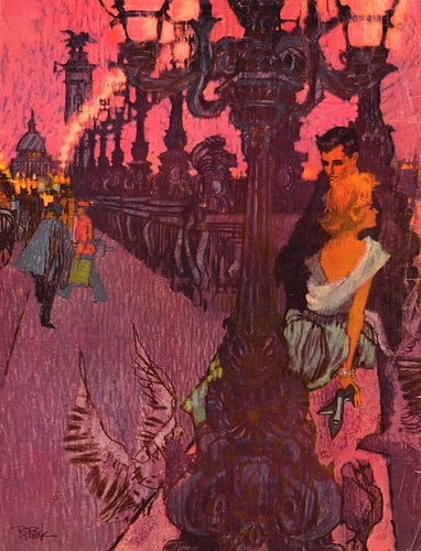
In his article in Illustration magazine #6, Thomas Peak, the artist's son, writes:
"Using the [Old Hickory] bourbon campaign as a springboard, it was only a matter of months before Bob found his illustrations on the back covers of Look and Life magazines, and he went from making virtually nothing a week to making over $40,000 a year. In quick succession, Bob Peak had established himself as a name in the commercial art world.
The impact of his work with the Old Hickory campaign led him to other assignments from Pepsi-Cola, Chrysler, and Dobbs Hats."

Bob Peak was named "Artist of the Year" by the Artists Guild of New York in 1961. At last, he had arrived.
That same year, Peak began what would be a long, successful association with the film industry. Tom Peak writes, "David Chassman, an executive at the United Artists film studio, hired Bob to create a new look for a feature film version of the hit Broadway musical West Side Story [below]. Up until this time, the major studios such as Universal, Allied Artists, and MGM had used illustrators such as Reynold Brown, Ken Sawyer, and Joe Smith to create the “key art” during the ’50s and ’60s for westerns, romances, and monster movies. The art created for this film was a radical departure from the established styles of these other artists."

As Bob Peak's popularity spread far outside the New York market, even art directors in far-flung regions, typically working with smaller budgets, were making exceptions if it meant they might get Bob Peak in on an assignment.

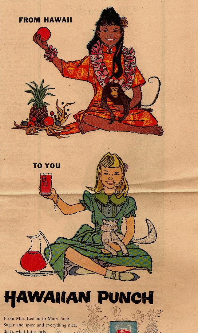
Charlie Allen, who worked in the San Fransisco area, sent the pieces above and below and writes, "Saw the two Hawaiin Punch originals at McCann-Erikson and was a bit miffed. I'm positive they paid Peak more than we local yocals... they were tight spenders locally!"
While many other formerly successful illustrators saw their own careers sinking beneath a tide of change that was sweeping through the print industry in the early 60's, it was 'full steam ahead' for Peak.
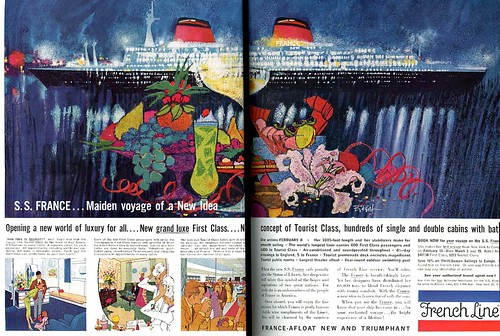
His tremendous popularity didn't neccessarily convince all of his peers of the merit of his work, however.
David Apatoff relates this anecdote:
"In 1964, the Famous Artists School wanted to put out a new edition of their materials, and wanted to bring in the younger crop of fashionable illustrators so that the FAS would appeal to the next generation. So all of the old greats-- Dorne, Ludekens, Rockwell, Briggs, etc., -- had to pass judgment on who was good enough to join "the club." Most of the choices were obvious, but there was a real split of opinion over Peak. Some of the old guys (led by Briggs) thought that Peak was flashy, but just not good enough, and strongly opposed extending him an invitation. Ultimately, they chose to invite him."
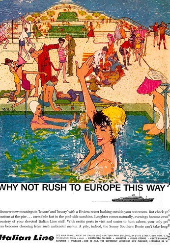
Because inevitably, there was no denying that the 'Golden Age' of 1950's illustration was over - and it was time to adapt or die. As Charlie Allen puts it, "To be honest I wasn't a big fan of Bob Peak's work until he began the amazing Hollywood movie posters. Wow! Wasn't a big fan of Potter or Hays, but I did use techniques, more underpainting, textures, etc. they pioneered."
* I have many people to thank for assisting me with this week's topic: Barbara Bradley, Charlie Allen, David Apatoff, Tom Watson - and today, Larry Roibal as well - for their advice, opinions, information and scans, and Dan Zimmer for allowing me to excerpt passages from Tom Peak's article in Illustration magazine, which are ©2003, 2008 by Tom Peak, Dan Zimmer and The Illustrated Press, Inc., and all artwork © The Estate of Robert Peak.
There is much, much more on the artist at Bob Peak.com
My Bob Peak Flickr set.
Post a Comment